Did you know that pure black text can cause eye strain? A survey found that “58 percent of adults in the U.S.” have experienced eye strain from working on computers. Designers can do their part to reduce the likelihood of eye strain on their designs by paying attention to the color of black they use.
Pure Black Text on White Backgrounds
Pure black text on white backgrounds can cause eye strain when users read the text over an extended period. White has 100% color brightness, and black has 0% color brightness. Such a disparity in color brightness creates intense light levels that overstimulate the eyes when reading text. This causes the eyes to work harder to adapt to the brightness.
An example that illustrates this concept is when we turn on a bright light in a dark room. Such a drastic change in light conditions is harsh to our eyes. But if we turn on a dim light in a dark room, our eyes adapt to the change easier because our retina isn’t overstimulated by such a sharp increase in contrast.
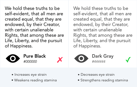
Instead of black text, use dark gray text on a white background, so the change in brightness isn’t as drastic. This prevents overstimulating the retina and allows users to read for a more extended period.
A research study found that “black text on a white background overstimulates the OFF ganglion cells while white text on black background overstimulates the ON ganglion cells.” This finding means that “white text from a black screen could inhibit myopia, while black text on white background may stimulate myopia.” The study advises against reading black text on a white background due to the striking effects of contrast polarity.
White Text on Pure Black Backgrounds
There’s also reasons why you shouldn’t use a pure black background with white text. A pure black background kills all light emitting from the screen. This makes eyes work harder and open wider since it needs to absorb more light. When this occurs, the white letters can bleed into the black background and cause the text to blur. This effect is known as “halation” and it affects users with astigmatism, which people of all ages could have.

Instead of a black background, use a dark gray background so that more light emits from it and the text doesn’t bleed. Doing this decreases eye strain and strengthens reading stamina.
High Contrast for Accessibility
Pure black isn’t harmful to all users. Low vision users, who are sight impaired but not blind, tend to read text better with pure black text or white text on a black background. When designing for them, you may need to use black for an accessibility mode. For normal-sighted users, stick with dark gray over black to prevent eye strain.
Balanced Contrast for Better Readability
High color contrast is useful for readability. Too high of color contrast, however, creates a significant disparity in light levels that affect the user’s eyes when they read. A balance of contrast between the text and the background color is an effective way to make your text safe for the user’s eyes.
If you’re unsure about your color contrast, you can use a color contrast checker to find an optimal range that works for you. It shows you when your color contrast is too low based on accessibility guidelines. However, it doesn’t indicate when your color contrast is too high. That decision is left for the designer’s careful eye to decide.
Text color isn’t limited to black and white, but it’s the most common color combination for text. Before designers use it, they need to think about how it affects the user’s eyes. Designing to reduce the pain of eye strain means users can spend more time reading and enjoying the content on your interface.
UI Design Kit
Affiliate

I agree with this, BUT being 58 years old, I find certain low contrasts more difficult to read. Mind you, not *really* difficult, just enough to imagine what it is to be really old 🙂 That is why I find the given examples of grey #444 (you call it dark grey, but it is really mid-grey) on white, or this input while I am typing of mid-grey #787878 on light grey #FAFAFA, too much of an eyestrain for scores of people. WHY oh why is it a fad with designers to use grey on grey? Why use less contrast and make it more difficult for people to read?
So yes, by all means do not use black, but beware of the grey sludge.
light grey fonts advocated by morons,, these are people who believe they know better but do not have a clue !
Correct! Light grey on white background is a killer for my eyes!
Idiots who never read a book don’t realize that all books use black text on white or off-white paper.
If you want to increase the reading comfort, THAT is the solution – change the background to off-white or a creamy color, but don’t make the text almost invisible by using light grey!
Idiots who think websites are the same as books don’t realize that the big difference is that screens emit light, books don’t, so you can’t really compare it that way.
Of course light grey on white wouldn’t have enough contrast to be legible but the contrast with black is just too much. That is why the article mentioned DARK GREY, not light grey. Going even darker will probably make more sense, or go with a lighter black paired with a lighter grey which still gives you good contrast but not too harsh.
Dark grey isn’t much better.
It’s the same idiot. You can read book because there is light source. That light source is reflected by the book, in other word, it is being emitted indirectly by the book.
Bring back pure black. My eyes are screaming. These people are stupid for considering gray!!!
Early days of web site development used black text and i yearn to return to simplicity. It seems that designers go too far with grey text, to the very edge of readability and then some. Solution: give the reader the option to adjust web fonts as needed. Not hard to do and there are contrast plugins for browsers available now. The new tools work pretty well but
could be improved.
I call BS…! I am 77 and no grey text is easier to read. It strains my eyes. I am a voracious reader and I have never read a book with grey text! I had to really look hard and find a software program to make the text I am reading black, bold or larger. Wonderful program: “Make Chrome Text Black” … https://chrome.google.com/webstore/detail/make-chrome-text-black/hlihhjmofodfndfnpjlcabdaimecephb?hl=en
It is not free, but it is so worth it! It also works on OPERA browser, which I use.
so many people follow the logic here without understanding the eye strain issue. putting gray text on a white background is worse. the contract intensity of Black on White is known, but shifting to gray is the wrong approach and it’s disappointing. the government gleefully adopted this internally with all presentations mandated to use gray. after pointing out that the concept was false and made reading more difficult the government simply stated – it saves ink when printing.
Readability. Let’s talk about reading on screens. Black text on a white background is best, since the color properties and light are best suited for the human eye. That’s because white reflects every wavelength in the color spectrum
BUT: having a dark background with light text causes far less eye strain because you are not being bombarded with white space around the text you are reading. best combo is a dark background with yellow text.
Dear Anthony,
Thanks for sharing your ideas.
I think your article heads for the right direction but misses the point.
It is due to one of the most commonly forgotten interface design principle: no one likes to look into the sun directly. In the Internet we are doing this most of the time.
So, not the text color is the problem with black text and white background but the background color. It is the same vice versa: white text color is blurred.
A better headline of your article could be: “Why You Should Never Use Pure White for Text or Backgrounds”.
Best, René
I couldn’t agree more! I’ve always said – change the background to off-white or some creamy color, not the text!
Why does nobody listen?
I immediately click the back button and exist a site when I see that stupid choice.
Agree, BUT we’d fail our WCAG 2.0 test requirements.
Then ask for a change in the freaking WCAG! It’s the user’s satisfaction that matters first and foremost, not a stupid set of rules for whose benefit??
Exactly! This trend to make readers strain as much as possible when trying to read is infuriating.
Your comments are misinformed. You can be well-passing WCAG 2.0 level AA, even level AAA color contrast without having pure black on white text.
Your text colour can go as light as #595959 on a white background and still pass level AAA in WCAG 2.0.
Your text can go as light as #767676 on a white background and still pass level AA in WCAG 2.0.
The white text on the #444444 background shown in this article also passes level AAA.
There is quite a wide happy medium which prevents eye-strain for most readers while also keeping the text readable for people with low vision. Always test your text colour against it’s backgrounds using a colour contrast analyser tool.
I agree with most of what you wrote. But one thing is clear that most designers don’t use ‘dark grey’ for text but other lighter shades of grey that most older readers cannot read. I believe that true black for text against a non-white background is still the best for displaying text.
I think the #444 gray is too light, but I think it’s the weight of the font more than just the color itself. #444 is actually somewhat dark as a block of color. Personally I wouldn’t usually go brighter than #333, at least with text set like yours.
Worth noting is that this article itself is #333 text on an off-white background, which to me is preferable to the proposed solution.
Some articles from the opposing perspective are:
https://www.wired.com/2016/10/how-the-web-became-unreadable/
http://uxmovement.com/content/why-your-gray-text-should-never-exceed-46-brightness/
(Those articles don’t say you shouldn’t use gray type, but rather argue that many web designers are using too much gray, too light of a gray, or too little contrast.)
A design professor of mine in college once said, “Black isn’t a choice. Light black is a choice.” and I’ve never looked back.
Couldn’t agree more! There’s definitely a time and place for 100% black. Typically I’d say reserve that for print and visual image elements. Black text is incredibly harsh on the eyes, and a black background can be just as glaring. I use 80% Key (black) in my branding along with #333 for website headings, and #666 for my screen fonts.
Very nice little article. 🙂
Great point. Black always looks cool but let’s face it, it’s too harsh on the eyes. Grey all the way!
Personally I agree with you, but in some cases (some industries) using pure black works better than gray.
Like Apple, The Final Cut page has black background but either is not #000000. Few years ago, the whole page of the mac pro has also black background. Now on 2020 not too much, mostly the navbar and they combine some sections black background and aside section white background.
I really hate the way you’ve framed this argument. You give no evidence as to why pure black is bad, instead your whole argument is that high contrast is bad (which I generally agree with). I think, for a variety of reasons (power saving on OLED displays, looks better, contrasts the pure white of normal backgrounds), that pure black should be used as a background in dark modes, with the text and related elements being light grey.
Pure black backgrounds are largely unreadable and give me a headache. It’s like staring into a lightbulb. I won’t read any website that uses it because it is literally painful. On Firefox, there is an app available that will switch the background to white but I haven’t found anything for Chrome yet.
I would also disagree that pure black looks better.
Pure black backgrounds also can save electricity/battery on oled devices like iPhone X
I was going to say the same. I think this is one good and valid reason to use true black #000000
I’d guess the topic cares more about the end user, and not the developer’s eyes. I started out as a Cobol mainframe developer. All the while, mainframe emulators default to black background, green/yellow text. the MS-DOS command prompt or linux console gives the “hackerman” feel, but was it actually straining our eyes all along? I’m glad i’m into testing / test automation nowadays and might probably try the #444 settings for the Eclipse IDE…
It’s hard to read gray text. #444 is way to light. Perhaps between #2a2a2a and #333 is more acceptable to me. Also the font text color (#787878) for the textbox for leaving comment is absolutely unreadable, as it blends completely into white background. I prefer to read a black text on light background, rather than gray text on white background.
Also, it applies to printed text as well. I recently tried to read a book, but the text was printed in brown ink, not black (for stylish reason?) Why? I asked. It was horrible.
I know that brown text is easier to read than black text on a book too!
My 85-year old eyes find it very difficult to read light gray type in internet items.
I use the Chrome browser, so I frequently use the high-contrast viewing option
to show the text in white against a blacl background.
Furthermore, when I copy the text in a document, I change the color to black.
So, I may be in the minority on this topic.
The result of graying the text is NOT readability; it is eye strain.
Telling the pro-gray text lobby that high contrast is better is like telling the Emperor he has no clothes. Everyone else knows it, but not the designer.
Designers are wonderful and make using the Internet often a joy. But this graying is misguided
Ask my ophthalmologist.
Larry
Well said Larry,
It’s not the black text that is the problem, it is the illuminated page.
Is there a pro black-text lobby group we can join? 😉
I’ve got my “Drain the grey-sludge!” banner ready for the march.
Regards, Gary.
This will all change when millennials become 50+ years old and realize how hard it is to try to read grey.
I’m a retired website designer and I bought a new microwave oven yesterday. The input touch pad has a relatively dark gray type on a black background which is nearly impossible to read. This started me wondering when the whole gray on black trend started and why. It’s not just an issue on the web, it’s everywhere from microwaves to keypads to websites. The basic point of type is for communication and I think graphic and industrial designers have lost their way. My 76 year old eyes aren’t that bad and I curse those websites with reverse type of any color or contrast.
As others have pointed out, overly low contrast is a much greater problem. Sites with too high of a contrast are about as rare as middle-aged women who think they’re too skinny.
I”ll chime in with the other oldsters. If I pick up a book and the font is a feeble gray (like on this webpage !) instead of a robust black, I simply don’t read the book. I think designers make a foolish and unkind mistake if they dial down the contrast . My specualtion is that such designers are not in fact serious readers at all, and not in the habit of spending hours on books.
I don’t think black itself is the problem, rather having too much contrast with it.
Remember MS-DOS? What colour-scheme did it default to when you booted the machine? Grey on black.
Open a command prompt in Windows, and what colour-scheme do you see? Yep. Same grey-on-black as on DOS.
Hell, my shiny new Linux Mint distro has an option in the Terminal program for grey on black.
Seems #000000 and #AAAAAA works pretty well if it’s maintained a legacy for over 35 years.
Also, just because making the contrast too high can result in a lot of glare doesn’t mean you should make it really low either. Too low and it’s hard to read. Find a balance. The engineers at IBM and Microsoft in the early 1980s did, so you can, too.
I heard that if I become 40 years old I will wonder how hard it is to read dark gray on a black background!
Even this page about contrast is horrible! The text I’m typing is way too light,, as are the date info attached to articles and comments. Basically,, the entire page is lacking sufficient contrast.
As an aspiring graphic artist I really like most of the posts here I learn so many things. I also encounter this kind of problem before. If only I discovered this site sooner I might get positive feedback from that client.
I’m increasingly annoyed by light text on webpages, especially when the articles are long, and I’m trying to read them on my phone.
It really is nothing more than a misguided fad. As some one else said, even typing a reply is actually straininng my eyes as the font is too low contrast. What the hell happened?? Even big name companies have gotten in on this idiotic practice. jesus Christ.sight
You’re an idiot. May you live long enough to realize this. Have you ever heard the phase “gray and grey”. It carries no meaning, but “Black and White” does. I can barely read what I’m typing because some fool has lightened the font to the point that it’s almost invisible. I want my comments clear and understandable not shrinking away and avoidable. And at the same time I want to be seen and comprehended by everyone that cares to read this. This weak gray-scale fad is the modern day equivalent of the sneaky fine print that scammer worms used in the past. The less you want to be understood the lighter the type.
Who died and put the GRAY dictator god in charge and why can’t the user have the option to change it?
I support all the Anti GRAY text comments. I typed my comments in MS Word 2007 so I can see what I am typing then pasted them here. You can say all the good things you want about the benefits of GRAY text but if all you are doing is making a bunch of people mad then shame on you.
Who’s in charge of this GRAY text movement anyway and why won’t they step up and say or do something?
The Gray text is very irritating. I’ve had 11 eye surgeries and I just want to make things easy for me to read. Black text was very comfortable for me to read, GRAY is NOT.
The Surgeon General says smoking is bad for your health. But at least one has the option to smoke, I don’t smoke.
Drinking alcoholic beverages can be bad for you health but at least we have the option to drink them. I do drink.
I don’t need some goodie two shoes forcing something down my throat just because they think it is better for me.
Someone has got to have the power to give us the option to set our fonts for our own eye comfort. Everyone is different.
Hoping for the Option.
Larry
Larry … to answer your question, “Who’s in charge of this GRAY text movement anyway and why won’t they step up and say or do something?”
Personally, I think it’s a conspiracy by the Millenials to make the rest of us go blind!
I also totally support your “Black text was very comfortable for me to read, GRAY is NOT.” statement.
I TOTALLY agree… I can read black font and see black field outlines as clear as day… But all of a sudden, every menu and every field outline was not only gray, but was a very, very light gray that is almost invisible to me. I’m of that age too and I’m looking of things to help me see better, not worse! BRING BACK BLACK FONT!!!
Please stop this eye-straining grey fad.
So far I have yet to suffer eye-strain from “too black”.
(Maybe that’s because I’ve reduced the brightness of my screen…..)
I’ve lost count of the times I’ve searched for a way to over-ride grey text ……
…. like in this article and comments input.
If only Browsers had a toggle for Black Text …
In your article, you have a section titled “Pure White Text on Black Backgrounds”.
In the text, you talk about using grey text on black background as being preferable over white text on black background, *but* the sample you show is not what the text describes. In the sample, you contrast white on black background with white on grey background.
It’s true. There’s nothing worse than flat black all the time.
Clients really notice the difference and the user experience is markedly superior.
Remember #444444 always my friends!
Cheers
Bren
Bren,
Please post a link to a site with text that is “too black”.
Seriously, I’ve yet to see one.
Thanks
p.s. If the emphasis was on “all the time”, then I would agree.
Too many sites limit their colour palette which is poor for navigation and boring to read.
As for “User experience”, there are loads of forums with Users complaining about unreadable grey being foisted on them – worse when a previous version was OK.
Only yesterday I was on a finance site – with links to “new pages”.
The “old” page – a just-about-readable mid-grey.
The new page was a mixture of barely and unreadable pale greys.
What are these Designers seeing ???
I completely agree with you Julus!! As a 56 year-old, the grey text just keeps getting lighter and lighter. I personally prefer absolute black (#000000) for text, but I know there are those in the UX world who say it’s too harsh. While using something less than black (#444444) is acceptable, any lighter than that and the contrast of the text on the page starts to become problematic. Unfortunately, it’s just getting worse and worse and the grey text just keeps getting lighter and lighter. I have now gotten to the point where I simply close any site that I can’t easily read.
Something else coming into play here … UX Designers are often the people in charge of picking out “standard” colors that employees / associates must use for any and all communications. This causes some serious problems … especially for those of us in the training design & delivery world. Try being forced to use grey text in a PowerPoint training deck where the participants run the age gambit and some of the participants have to view the session from the back of a large room.
I recently discovered what I believe to be THE worst example of unreadable grey text on a website … and it’s from a Marketing company!!!!!!! If you’d like to take a peak, access the following Dropbox folder to view two screen captures I took from the site:
https://www.dropbox.com/sh/nft5whvub3d4z7q/AADs4QL5iVOx4NcmeqtShO1xa?dl=0
With so much anti-gray sentiment, why doesn’t someone listen? I am 82y old and struggle to read many things on my screen. Surely by now someone must have invented a way for a laptop user to select the colour/contrast of the type on the screen. I’ve just printed two pages of gray type and neither my wife or i can read them – the eystrain is painful.
I concur with Michael above
May 9, 2018 Reply
I agree with most of what you wrote. But one thing is clear that most designers don’t use ‘dark grey’ for text but other lighter shades of grey that most older readers cannot read. I believe that true black for text against a non-white background is still the best for displaying text.
I would rather have eye strain, than be blind. This low contrast movement is rendering me blind. Being blind creates an enormous amount of strain.
I wonder what you will say on this subject when you are 75 years old & have to use a magnifying glass to read an article several times just because it is GRAY!!
your contention that black, high contrast font causes eye strain and that gray font does not mocks optometry, optical dispensing and is not backed by any optometrists worldwide. Optometrists only project alpha-numerics in black, high-contrast and bold type during patient eye exams. There are NO prescriptions for corrective eyewear for light-value, extremely light-value, low-contrast and or nearly zero contrast type that is all the rage not only online, but which has morphed to all manner of hardcopy publication graphic design.
Any and all font-type and text that is non black, non high contrast is an enormous strain on eye and vision health. And that poor graphic design helps promote eye diseases such as cataracts, macular degeneration and glaucoma. It sets medical advances in optometry and optical dispensing back to the 19th century. The contention that gray font is healthy for vision is wrong and dangerously unhealthy. \Why promote a graphic design that mocks eye health?
I loathe the ever creeping movement to go to light grey thin fonts on grey backgrounds. I now loathe using my computer especially MS Office etc because of the eye strain grey gives me. I much prefer black font on a white-ish background.
Everything is washed out light blues/light greys on a light grey background…and people continue to complain but developers ignore all this. And given the lack of adjustment MS etc now allow us we get what they want us to have rather than being able, like in the past, to adjust ‘out user experience’. There is a major arrogance in software design these days which is basically: You’ll get what we give you because we know best EVEN if you do complain.
I spend more time adjusting my PC set-up to make it less fatiguing than I do working these days.
This militant light gray on even lighter gray trend misses the bigger picture. Gray on gray causes eyestrain because it is almost illegible, period. The user has to lean in close just to try to make out the text – causing neck strain as well as eyestrain. Since you have to hunch over constantly to get closer to the screen just to read some text, that makes low-contrast a very bad choice ergonomically. The poor posture required to read a low-contrast screen also aggravates lower back pain. And since the user is forced to adjust screen brightness to the maximum just to make the text half-way legible, that defeats the purpose of gray-on-gray right from the start. Think of all that extra radiation emitted because some designer unthinkingly followed the herd and used low-contrast text.
Low-contrast also violates one of the basic principles of good design. When you design a door, you don’t decide how high to make the door according to the height of just one segment – let’s say the shorter segment – of the population. And you don’t set it to accommodate the average height. Doors must be high enough to accommodate the tallest segment of the population, and they thereby also accommodate all of the shorter folks as well. Normal contrast accommodates almost everyone. Low-contrast discriminates against a large segment of the population, particularly older people, but also anyone with impaired vision. So low-contrast is bad from an accessibility standpoint as well. The constant aggravation caused by low-contrast text makes it a contributor to poor mental health too. Looked at from almost any angle, low-contrast is a poor design choice for text.
ps. I use a Firefox addon called Legibility which helps to up the contrast of poorly designed web pages, but Microsoft Windows is a lost cause. Office is now almost unusable. Maybe I should move to Linux…
I sbsolutely hate white text on black; it gives me a headache within a minute or two. I never connected my astigmatism to the problem before though. Now, if someone asks to look at their code in white-on-black, I say no.
Super article by Anthony, Thanks.
my suggestions are-
Web browsers are giving more importance to youngsters for their business mainly with social media interaction, games, movies etc. that is why grey (off-black) font. Their eye vision is OK. I think we should apply BLACK font in off-white background to get more preference to senior citizens. Around 38 yrs, vision problem may be there for an average people. For example, this comment box is dim, not so clear to my eyes! Reading habit will be a companion among old age. Use BLACK font on off white background, then it will compromise to all eyes. Also, we can reduce screen resolution to save battery charge. If grey, we need high resolution during outdoor.
Hi all
I apologise for this lengthy piece, but somethings just need more space to explain.
I am legally blind, with low vision. My personal preference is a white font, on a black background, because for my purposes, this works for me. The important words there, though, were ‘personal preference’, and what works for me, could easily be the precise opposite to someone else. Browsers give some control over website colours, but it is far from perfect, and different browsers help in varying degrees. In addition, I use Windows High Contrast Black, which for a long time now has helped to ‘level the playing field’ for me. Other low vision users may prefer one of the other ‘High Contrast’ themes, or perhaps none at all. It really does depend on the eye condition as to how your eyes react to different colour schemes.
The key here is choice…giving each user the choice to see a page in whatever way is best for them. However, there are two things that hinder this, and this is why I am writing to this thread. The first is contrast…the less there is, the less likely that my colour changing tools, such as High Contrast Black, or the colour inversion option in Windows ‘Magnifier’ , can help me. In short, I need the starkest contrast possible, preferably white on black, but at a minimum, black on white, in order to get my tools to be able to do the necessary. For example…if you put a pure black font, on a grey background, my colour inverter will change that to a white font on a grey background…and is no easier for me to read than the black on grey. If you give me black on white, my colour inverter changes that to white on black, which is exactly what I need.
The other absolute no no for me, the second hinderance I mentioned earlier, is a ‘two tone’ page. By this I mean a page that has areas of a predominently white background, with pockets of colums with text, the opposite way around, with a predominently black background. The ‘choice’ I mentioned has now been taken away from altogether. If I use my assistive software to invert one part of the page, it will be wrong for another part, not to mention that I will end up with a headache. One ealier contributor to this thread, likened viewing predominently white screens to looking directly into the Sun, and I totally agree with them, and this is where my headaches come from, and if any of you were looking into the Sun for a prolonged period, you’d get a headache too! Even if all the text on a page were in my favoured white on black, if they were surrounded by bright banners, or bright images or photos, I’d still end up with that headache.
Even though I have given much of my own preferences above, I think you’ll agree, there’s no such thing as a ‘one size fits all’ solution. There can however be a standard minimum, such as sticking to the starkest contrast possible, for the whole page, without having more than one type of contrast for different parts of the page, thus avoiding trying to have the best of both worlds. This allows us, the low vision user, to have choice, and to do what we need to do individually, to make the page accessible.
On an entirely different note, I do actually need some help solving a problem I’m having, and wondered if anyone with web development experience can help work out what the problem actually is? My problem is, that following a Microsoft update about 9 months or so ago, many websites gained a new look. Suddenly, my personal preference of a black background was being replaced by the two tone example I menioned earlier. I know this must be a web development issue, and not a browser issue, because all my browsers began behaving in the same way, and Wikipedia, my favourite site, solved this on their own, where many other sites, such as ‘HDtracks’ have not. Initially, part of Wikipedia’s frame work at the top, surrounding, for example, the search field, changed to white. In Wiki’s case, it was only this very top part of the page that was affected, and in any case, within a few weeks, the solved the issue, and it returned to how it used to look, with a black surround. Other sites, such as HDtracks, IOMIO, and classical.net, still have this glaring white framework, with little pockets of white text on a black background, which, because of the other parts of the page being so white, is making it nigh on impossible for me to read these little pockets. Can anyone shed some light on this?…or, more importantly, is anyone willing to allow me to demonstrate this via Skype or perhaps using remote. I am unable to produce screenshots.
Best wishes
Simon
Using gray text is a bunch of crap. I have been using practically daily computer since 1965, teletypewriters, punched cards and line printers, dot matrix printers, green screens, amber screens, now full color screens. I have never had an issue with black on white. I have not experienced eye strain. I have normal vision although I have worn glasses since grade school because of nearsightedness.
If the text is intended to be read then make it readable: BLACK on white. How many books and newspapers use gray on white? None in my 70+ years of reading experience. Why? They want the written word to be readable. Computer screens are no different.
Most of these assertions about eyestrain are not based on good evidence that either defines eyestrain or relates it to the issues mentioned here. Grey text is harder to read and that gets worse as it gets smaller, and for uses with mild visual impairment it quickly becomes a serious problem.
So I disagree with a lot of the argument here. It’s speculation.
I have to totally disagree with this article. Reading through the many comments only supports my position as well. IT TOTALLY DEPENDS ON YOUR AUDIENCE. And this appeals to younger people only. Older people or people with visual impairments do not find it easier to read or easier on their eyes.
I, personally, hate reading grey text and usually will stop reading it and move on to something else. I do not find it easier to read…any time….and I spend 10-12 hours a day working on a computer. The audience I write to are technical people…usually field installers. These are not people using a tablet or laptop in a remote location that doesn’t have internet access–let alone even cell access. They are often installers in remote locations who have a sheet of paper or manual with them to use when necessary. Further Bright White papers are designed to increase visibility of the text…in any color…why? because contrast improves focus.
Now for someone who plays video games or only reads things on the internet, this might seem easier on the eyes, but most eye professionals I know of will disagree with this.
The bottom line is, stare at anything for an extended amount of time and that will damage your eye sight regardless of the color. But you must take your audience into consideration when writing. People are not one-size-fits-all and to make such a global statement is rather short-sighted.
I think black background with a little colored text, for example dark orange, is best. Below this page the page has a black background and ice blue text, but then again blue prevents melatonin hormone.
This view is dated and should be unpublished to stop harming dark modes of apps and websites. Nowadays, there are AMOLED screens everywhere. These can turn off black pixels, rendering pure black. This way, black backgrounds look awesome, drain less battery and make the screen look bigger.
So when Apple released Big Sur they really changed the UI and for my eyes the white/Gray background with grayish text in places is just awful. I do agree Black text over white background isn’t good either. But older eyes like myself need more contrast than what Apple did in Big Sur. Then Apple added more transparency which adds to the issues.
Some of this can be minimized with Accessibility options to reduce transparency and increase contrast. But on my MacBook Air I had to lower scaling to increase text size too. First time I felt the default scale did not work for me. Some days it’s so bad I spend more time on my Windows 10 PC than on my Mac’s.
There is a fundamental flaw to this whole idea,
The fact that the use has control over contrast through adjusting the brightness and/or contrast of their monitor. So pure black background are no problem because the use can dial down settings in order to achieve the best contrast for their viewing.
With lowered contrast, the user has a much lower range of adjustment. Maxing out contrast in low contrast themes can improve readability, however with the penalty of loss of detail in images etc.
Some devices may also have much less available contrast/brightness than the designer due to the characteristics of their screen.
Also missing from this idea is the consideration for bias by designers due to their situation. Employed for extensive hours in front of their screens they become prone to the problems they are trying to eliminate, but then over compensate, reducing readability for users with lower screen-times.
I’ve never had problems with high contrast, but constantly have problems with low contrast websites that have flourished in the last ten years or so.
User applies the required filters to the display, NOT the original document.
Copying of documents is failing as scanners have less delta to play with. I now can not produce a acceptable document from a scanner due to being set DARK GREY as it washes out the text to a light grey. Also the use of recycled/thinner paper which is a tinge greyer than white adds to this dilemma.
This being unacceptable in the legal world.
It’s amazing how many web “experts” can’t think things through. Mankind has been using black print for almost 5000 years. Just in case you missed it, a computer screen isn’t like looking into the sun!
And with the very low educational level (and thinking ability) of Americans, there are always the supreme dimwits who use a very light gray on white backgrounds, “to make it easier to read”.
The next time you see someone hunched forward, staring at a computer screen, glance at the type. Gray, right?
The grey on black is easy to read in this attyical but norma;ly on the internet the grey on grey is so hard to read im squinting all the time so how is that good while white on black or black on white is eadsy to read and i have nos training t5o see the garbage on theik internet!!!
What a load of crap. I have astigmatism. Grey text on white background is harder to read than black on white. White text on a black background is easier to read than grey on black. Astigmatism benefits from high contrast.
I agree, but your article is in black too and so is this comment :O
I feel like most commenters are missing the point here to just take the opportunity to rail against too little contrast – when the point is just don’t do too much.
This site uses #222222 text on #F3F6F9 background. That is to say: gray on gray. Not black on white. Yet all these anti-gray comments don’t seem to have an issue with the grays they’re posting their diatribes on. Maybe there’s room for a middle ground between too much contrast and too little?
This page looked good to me, too, but only because I was viewing it through a simple Chrome extension I’m writing ( https://github.com/arpruss/Blacker ) that snaps text colors that are close to black to be full black (and has options for similar things for backgrounds and near white). I turned off the extension, and immediately the text on this page looked slightly blurrier and less pleasant to read. Once I’ve started using the extension yesterday, things look a lot crisper around the web to my 48-year-old eyes.
NO, pure black DOES NOT cause eye strain! All the books I’ve read in my life were printed in black.
What does make reading more comfortable is using an off-white or creamy paper (i.e. page background for online content).
Please stop propagating this crap about using light grey text on white background online – THAT’s what really causes eye strain.
The current trend of dark gray print on white backgrounds and white print on grey is more difficult to read! Advertisers and marketers need to stop with the home trending colors and remember the point is to be seen and grab attention. I have started skipping articles that use light background without dark black or blue print. Another thing … serif fonts are best for printed text, but something about web text and the reflection on a computer or phone screen makes serif fonts HARDER to read. The serifs basically fade. Stop straining peoples eyes and get someone, or several someones of varying ages, to test read your websites and articles before publishing.
You want to lower contrast to reduce eye strain AND save battery? DON’T use white background then! Black text is fine; It’s the white background with blinding white light that’s hurting people’s eyes! Grey text is NOT the answer!
All of these comments are frustrating…
How do you function as a design professional while being so dismissive of others?
Your entitlement as a designer does you a disservice. Exploration and development is dependent on openness… and I’m not talking about grey text. If you work with that attitude your drive will stagnate. Take a walk, get some fresh air and some new perspective.
Input boxes on the page are white. The page is nearly white. It’s hard to tell where the boxes are. The text in the article is gray. Hard to read no matter the background. At least the text in the input panes is easier to read. Why? WHITE background. It would be even better… easier to read… if it were pure black text, in BOLD, in a much better font, say a serif font, or cursive. The “modern” trend not to use cursive handwriting, or to use sans-serif font, has to go. Just because they’re not teaching cursive in the schools anymore doesn’t mean everyone should not learn it. It’s easier to write by hand, for one thing, and if everyone were like me, we would all be writing by hand instead of typing. MUCH EASIER TO USE black pen on white paper than using the internet. And I’m not old, not yet 60.
I came across this article after having a “do not use black” conversation with other UI designers. I was suspicious about the whole theory of “black does not exist in nature and it causes eye strain”. For those who think it’s true, just think about how the screen works—black is basically pixels that don’t emit much light (and it still emits light, even Dolby vision black in cinema still emit light). With that, the #000 black on screen isn’t black hole level darkness that we need to avoid, just like black in print is not dead black. On the contrary, White could be a problem as it emits as much light as a screen can.
I still would use black text on white and/or light grey backgrounds to keep contrast for who needs that, and for who wants less contrast, I recommend turning down the screen brightness.
Need to mention that black pixels on OLED screens emit no light, but what really could hurt your eyes is too bright, not too dark or good contrast.
Do the studies quantify how much lighter the text is that is less straining than pure black on pure white? Or what is least strain when the background is already light gray? Honestly I think what you want is not light grey, but something a person actually call black even though it is somewhat short of it. Your 444444 example is harder to read for me, not easier. Also I immediately noticed that your text on this page ever so slightly hard to read, making me wish it was darker.
I can’t tell you how many times I’ve been annoyed by a web page that was hard to read because the text had too little contrast with the background. I don’t recall ever being annoyed by too great of a contrast. Still, I’m willing to believe the readability ideal is short of pure black on pure white, but I think that ideal is only subtly adjusted from that, not the very strong adjustment you are making here.
This is the most asinine argument. You blather on about to much light being thrown into viewers eyes while advocating 1) a white background a 2 a font that is BRIGHTER than black.
Even your opening premise is bull. You claim 58% have suffered eye strain…yet give NOTHING to support your claim that has anything to do with your incorrect solution.
Nobody buys a book and rubs an eraser over the text till it is only 25% as dark as original. Because gray on white is asinine
I’ve got better vision than my average coworker (we’ve tested!), and yet often have issues trying to read the gray-on-gray text I see on modern webpages. I’ve never had any trouble with black-on-white.
While it may be true in the some cases that dark gray on white can be easier for some people (and harder, as you note, for others), you have to be very careful with this advice. Web designers today take it to extremes and make designs which are very pretty, and basically unreadable.
Besides, any such advice completely ignores the user agent. The user’s operating system, file manager, email client, calendar, etc., almost certainly use pure black and white, so if the contrast of pure white is such a problem for them, they can just turn down the brightness of their display. This is typically much easier than increasing the contrast, for when a web designer picked gray-on-gray.
I found this article after googling “why is the high contrast font easier to see?”. I was playing with my Samsung s21+ settings and decided to see what high contrast m looks like.
This is a life-changer for me. I hold my phone so close when I don’t have my glasses on(bc I’m laying in bed). I can see so much better at the same distance. I have astigmatism with -5 and -5.75. Please listen to those of us that are visually impaired.
There isn’t any evidence that general eye strain causes your eyesight to get worse. High contrast fonts and themes make using our devices easier. A tenant of designing for disabilities in general is to ask and listen to what the community says they need.
Your contention that black type on a white background is visually unhealthy is not supported by any optometrists, ophthalmologists and or opticians, at least on planet earth. There are no prescriptions for corrective eyewear (eyeglasses, contact lenses) for any type-font and text (hardcopy, website) which is non-black, non-high contrast and non-bold. And during patient eye exams, optometrists only project alpha-numerics (letters, numbers) in black, high-contrast bold type. Your own example, above, showing two boxes, one labeled Pure Black, increases eye strain, and Light Gray decreases eye strain, shows just how removed from reality and how fanciful your thinking is re: eye and vision healthy text vs text design which is vision straining and which promotes the premature development of eye diseases, e.g. cataracts, glaucoma, macular degeneration. More and more younger age people are getting cataracts and having surgery now; for this Microsoft can be ‘thanked,’ along with the company giants Facebook (and subsidiaries) and Google (and subsidiaries), each of which needlessly promote eye-disease with their irresponsible, rampant and widespread use of light-value, low-contrast type. And sadly, that assault on the eye and vision health of the public has morphed to all manner and size of hardcopy publication text design, from small, e.g. business cards, to medium size (newspapers, magazines, flyers, booklets, brochures, etc) to large (e.g. billboards). There is no excuse for anyone to be promoting eye strain and eye disease by advocating the use of non-black, non-high contrast and non-bold type).
In my website, visit the Sight-seeing with Dignity art series to view parody drawings I’ve made about the BBC (news, online); the New York Times (hardcopy edition and website); the Seattle Art Museum publications (hardcopy and website) and Microsoft, Google and Facebook. These are in the Sight-seeing with Dignity art gallery, scroll down to SWD 40, SWD 41, SWD 42 and SWD 46. Each image can be clicked to open a larger photo with accompanying Description text.
~
re advocating the use of non black type: If one likes or is even excited by the idea and thought of having one’s eyes surgically operated on, then by all means, go for it.
Cheers, good luck!
About that “research study” that;
“found that “black text on a white background overstimulates the OFF ganglion cells”.
(Assuming that such over-stimulation is a problem……)
Where does the “study” say that the problem is the black text – and not the white background ????
Please answer me that 😉
Also, please refresh the survey link in the first line.
“Did you know that pure black text can cause eye strain?”
How is this statement supported by a survey reporting:
“58 percent of adults in the U.S.” have experienced eye strain from working on computers.”
Eye-strain could be caused by:
a) Reading pale grey text, foisted on them by web-designers
b) Workplace lighting. (Neon lights with a barely perceptible flicker can cause eye-strain)
More importantly, please provide a link to a site where the text is “too black”.
Totally agree. I hate grey type. Too hard to read and so I won’t read it. That’s an communication, marketing and fundraising problem. Many designers have “young” eyes. Good for them. Most money sits in the pockets of older people, who clearly have a harder time reading grey type. You can’t find books printed in grey because….unreadable.
You are full of shit! I have been looking at black text on white paper for 58 years and on computer screens for 25 and never had any problems at all. Now, because all of you assholes have fallen in love with this grey text on light grey background or, better yet, yellow text bullshit I am now unable to work. Silly ass wokeism being forced on everyone because you think you know better. FUCK YOU!
Disagree on Dark Gray on White Background, it makes my eyes hurt.
Agree on White on Dark Gray Background, however I prefer more darker grey.
This article makes a lot of assumptions and misreads the relevant research that it claims as references, and provides links which are essentially dead. Allow me to clarify:
**PLEASE STOP USING GREY TEXT**
Please STOP using grey text. The problem is not black text, the problem with fatigue is excessive luminance using a full white background on a self illuminated monitor. Stop using full white for the background behind body text, but DO use black text for body text—the small thin font of body text needs substantial contrast, and black is ideal for body text against a light background.
Instead of #fff for the background, try #e8e4dd which, with black #000 text is an APCA contrast value of Lc 90, and ideal for body text. See:
https://www.myndex.com/APCA/?BG=e8e4dd&TXT=000000&DEV=G4g&BUF=A22
For large and bold headlines, the text contrast can be reduced slightly. But not body text. Contrast is not one size fits all, the size and weight and specific use case has much to do with the actual needed contrast.
I discuss the misunderstandings regarding grey text at length:
https://atangledwebweweave.com/please-stop-using-grey-text-3d3e71acfca8
Seriously, people are misinterpreting the published research. Grey text on white is not good, it is bad for everyone.
Thank you for reading.
Andy
*Opinions Expressed are Mine and Not Necessarrly Those of the W3C or AGWG.*
Andrew Somers
W3C AGWG Invited Expert
WCAG 3 Co-author, Visual Contrast
Theres a lot of conflicting opinions here, from “young designer eyes” to the lighting environment etc… One thing that’s proven science over all of this is the font choice and typesetting. Frankly, it’s amusing to see how petty the comments have got here over the last couple years… Regardless, use whatever color type you belive is a decent legibility or contrast to its background. Most of your readers are unlikely to actually care, so long as it’s actually legible, written for human consumption, and your typesetting isnt absolute garbage.
I can only respond regarding my own eyes. In both the examples shown in this article, I find the black on white or white on black much easier to read than the ones with gray….so I totally disagree with the article and research data. I have to wonder what was the age bracket of the people used in the research? It makes a difference.
I hate the grey washed out look that’s all over the web these days. I design and publish web pages but I have never jumped on the gray wagon. I believe in legibility. I have read through all the comments here and the overwhelming majority is against this grey fad. What’s funny is the author has listened and changed the background of this page to an off white (HTML #f5f6f7) with text in a true dark grey (HTML #222222). It is now very readable. However, the author has chosen to a use pure white background (HTML #ffffff) with a lighter gray text (HTML #333333) in the comments box. This works okay and should be the absolute lightest gray that any designer should use.
This is all BS. I was one of those who fell for this fad and implemented grey text on white background on my website. It has lost most visitors and rankings. I have redesigned the site and returned to (almost) black text on white background (#282828 on #FFFFFF) and literally the next day after that, the amount of returning visitors to my website increased by 300%.