Many designers assume that center or right aligning their website logo will make their brand more memorable. Research has shown this assumption is not true.
In fact, straying from a left aligned logo can make your brand less memorable and even your site harder to navigate.
Right Aligned Logos Weaken Brand Recall
A study conducted by the Nielsen Norman group concluded that more users remember brands when their logos are placed on the left rather than on the right. They found the “average lift in brand recall was 89%” when the logo is on the left.

When users scan sites, their visual gaze leans toward the left. A logo placed on the right will get fewer visual gazes, which results in weaker brand recall. Placing your logo on the left gives it more visual gazes, which allows more users to remember your brand.
Centered Logos Impede Navigation to Homepage
The Nielson Norman group also did a study on center aligned logos. They did not find a stronger brand recall with center aligned logos more than left aligned logos. Other design factors such as logo contrast and legibility have more of an affect on brand recall.
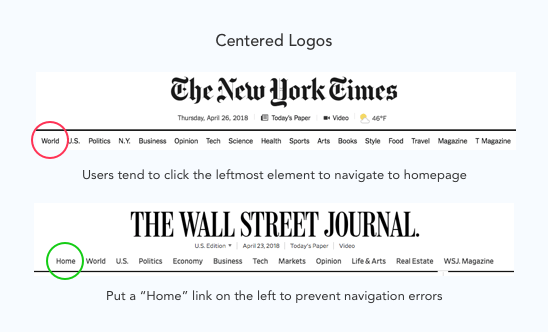
Not only that, but they also impede the user’s ability to navigate to the homepage. The results showed users are “six times as likely” to fail to navigate to the homepage in a single click when the logo is centered compared to left aligned.
Users have a conditioned habit of clicking the leftmost element to get to the homepage. If that element is not the logo, they’ll click whatever link is there. This navigation error can send users on a journey through several wrong pages before they find their way home.
One way to prevent this navigation error is to place a “Home” link on the far left side of your navigation bar. When users gaze left to navigate to the homepage they’ll spot the link, and click correctly on the first try.
Left Aligned Logos Work Best
If brand recall and homepage navigation are important to you, follow the convention of left aligning your logo. Users scan pages starting from the top left corner going left to right down the page. This means users will gaze more on a left aligned logo than a centered or right aligned one.
![]()
The more visual gazes your logo gets, the easier it is for users to recall your brand. Placing your logo on the left also reinforces the user’s habit for clicking the leftmost element to get to the homepage.
Cultural Differences
Most languages in the world use left to right scripts, but there are a few that use right to left scripts. This could mean right aligned logos on sites with right to left scripts (e.g. Hebrew, Arabic, Persian, Urdu) may be better for brand recall and homepage navigation.
The research presented did not test this theory, but future studies should. Regardless, it’s a good practice to align your logo on the side where user gaze leans.
Following Conventions
Your logo has a major impact on a user’s first impression. If it isn’t memorable, users are less likely to revisit your site. The logo alignment on your header plays a key role in determining brand recall.
Left alignment for logos is a convention users expect and are most familiar with. Straying away from it won’t make your brand more memorable.
User gazing and navigation habits should dictate where you place your logo. Following this logo convention, not violating it, is the best way for a brand to stand out.
UI Design Kit
Affiliate

Gotta love the irony of reading this article on my phone and seeing the uxmovement logo centered at the top of the page. The screen shots in the article are clearly not a mobile device though, so I wonder if logo placement plays as big a role on a mobile device, ie: smartphone, as it does in a desktop browser given the limited horizontal real estate on a mobile device in portrait mode?
The effects of logo alignment on mobile are not as salient due to the lack of horizontal space. Left and center aligned logos are both as effective because the difference in pixel spacing is negligible. Right alignment may be a different story.
Great article, but you seem to have missed out an important factor – context. It all depends on the type of website and how well the brand is known. As a regular reader of the Guardian website, when I visit the site I am entering the name of the brand into my address bar. Therefore brand recall is irrelevant. You could even argue that the placement of the Guardian logo is better on the right for the type of website that it is. As a user, I go to the site to see various types of news and the logo gets out of the way of me navigating the various types of news articles. Good article as a whole, but I do think context,existing brand recognition and the type of website are important factors.
Your New York Times example is of their header on their homepage. In that instance you don’t need a “home” link. On their interior pages, the logo is centered but there’s a “Home” link directly to the left of it.
I have to say that I completely disagree with the logic that a centered logo doesn’t work or somehow impedes the navigation. I personally like the centered logo on some sites. It has a nice symmetrical feel to it. I have centered the logo on a few sites, never had a complaint about usability. I do agree about right aligned, now that doesn’t make sense.
“I have to say…I completely disagree…I personally like…I have centered…I do agree…”
It seems like your objections are largely based on your opinions and experiences. Isn’t it a safer bet to make decisions based on the study that N/N Group produced, rather than more ” I feel that…” logic?
He’s biased because he’s used centered logos on his designs in the past. Agreeing with the study would denounce his past actions. Denying it would justify his past actions. It’s a case of choosing comfortable subjectivity over uncomfortable objectivity.
The study never tests the idea of center vs left aligned, without data on how a center logo performs vs a left who is to say that center isn’t better?
The way I see the number If the left menu item is the most clicked I would then put the service/product I want the vistor to click on most in the now coveted/used far left spot.
It did test center vs left aligned. Check the studies again.
Hey Anthony
Is it just me, or do people really like hatin’???
Nothing earth shattering in your piece – makes sense on a common sense level, and is something I have always just “got” – but you expressed it well, and backed it up with some research base.
Enjoyed the piece, gonna take a look around at some more stuff you have on here…
Good luck.
We just ran an AB test at the organization I work at on placement of the logo in the header (left aligned vs. center aligned) in regards to navigation. With a test sample of over 2 million views we saw nothing statistically significant. This report by NN is certainly interesting but I encourage you to do your own testing in context of your own product when possible.
Great blog! I always put my logo on the left side, Logo in center doesn’t look good at all.