Are you choosing colors for your interface that strain the user’s eyes? If you’re using a bright and saturated color for your background, you’re making it hard for users to keep their eyes on your page.
Bright, saturated colors attract the most user attention. Too much of it in a large area overstimulates the retinas which can strain the eyes.
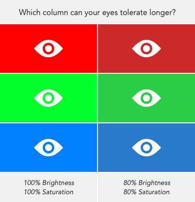
For example, stare at the color swatches in the image above. The left column consists of colors with maximum brightness and saturation. The right column is only 80% of that. Your tolerance for staring at the left column will be lower than the right because the bright, saturated colors are harsh on your eyes.
Brightness Vs. Saturation
Brightness and saturation are different color properties. The former refers to how much white or black is mixed in a color while the latter refers to the amount of gray in a color.
Increasing brightness is not the same as decreasing saturation. When you decrease saturation, you turn the color into a shade of gray. When you increase brightness you turn the color lighter but without making it gray (source).

Effect of Color on Attention and Arousal
A study, “Effects of hue, saturation and brightness,” discovered that colors with high saturation and brightness attract the most attention. It concluded that these color properties are more important in drawing attention than hue.
Two other studies, “An arousal effect of color saturation” and “Color and emotion,” found that bright, saturated colors have links to high arousal. Hue also affects arousal, but saturation and brightness have a more significant impact.
Reserve Bright, Saturated Colors for Buttons
A bright, saturated background color will draw user attention, but it won’t hold it. Using them is like screaming at users when they’re in front of you. You’ll get their attention, but they’ll soon look away because you’re jarring them.
You should only use them on interface elements that demand user action such as buttons. The color will draw attention to those elements and make them easy to find when users are ready to act.

Use Darker, Less Saturated Colors for Backgrounds
It’s better to make your background color darker and less saturated. Darkening the brightness decreases the white in it while desaturating it increases the gray in it. This tempers the color intensity it has on the eyes.
Not only that, but it won’t compete with page text or content for attention. This softening allows the user to read the page easier without visual distraction.

Examples of Good Vs. Bad Backgrounds
Below are examples of homepage backgrounds that strain the eyes compared with ones that soothe the eyes. Notice how long you’re able to fixate on the good pages versus the bad ones.

Bad greens Panic / Prismic, Good greens FreshDesk / Sigstr
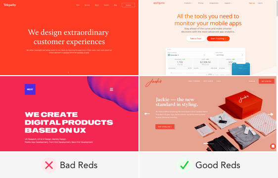
Bad reds Telepath / Meat, Good reds AppFigures / Jackie

Bad blues Compose / DareIt, Good blues Republic / MailTag
Aesthetics & Usability
Next time, before you settle on a background color, think about how that color will feel on the user’s eyes. Are your brightness and saturation levels optimized? Are users able to read the text with ease?
Color influences the aesthetics of a design, but it also affects the usability of it. Designers need to pay attention to both and make them work in tandem to please the eyes. You don’t have to sacrifice usability for aesthetics when you can have both to create an excellent interface.
UI Design Kit
Affiliate

I think this question can have a connection with your article. Why painters, not only modern, but also renaissance painters, used saturated nuances or colored-grays in warm-cold relation, diminishing the value contrast between them, on planes with rectangular and symmetric outlines (chest garment of a bust-portrait); and increased value contrast between colors to define planes with sharp angled and asymmetric outlines (face features)? I think your tip about the link between the size and saturation of a shape can influence the answer, but I can’t see how. It is just an intuition…