Imagine a user who is ready to sign up for your site. They go to your form and enter their information. The way you align your field labels affects how quick users can fill out your form.
Do you want to provide users with a painless experience or do you want to give them a hassle? If you want to make their experience quick and easy, use top aligned labels on your form fields.
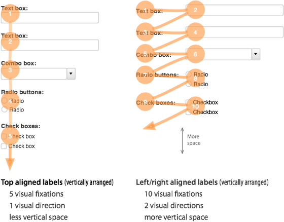
Top aligned labels are faster and easier to fill out than left and right aligned labels. This is because top aligned labels only need half as many visual fixations. Top aligned labels also allow users to move down the form in one visual direction. Left and right aligned labels require two visual directions to fill out.
The only drawback with top aligned labels is that they can make the form long. But users are scrolling more often these days, so this isn’t a problem. By reducing the whitespace between fields, you can decrease the form length. You can also break the form up into multiple pages to make the form shorter.
The difference between top and left/right aligned labels is clear. Top aligned labels are easier on the eyes and make forms easier to fill out. Although they can make the form longer, users will benefit more from the less time and effort it takes to complete it.
If top aligned labels can give users a better experience with forms, it’s worth adopting. Designers should think more about their field label alignment. It can make the difference between users completing a form or abandoning it.
UI Design Kit
Affiliate

It’s good to see some fresh discussions on label alignment. I’d have to pick out a couple of points though.
1. users often scroll – in my experience of user testing, this isn’t the case. You’d be surprised at the amount of users who still do not scroll down screens past the fold.
2. top aligned labels make dramatic differences in completion times. It’s not a dramatic time difference, it’s very little time difference.
Overall, it is true that top aligned labels make some forms quicker to complete, especially in relation to registration forms where users are asked simple quesitons that they do not hesitate to answer i.e. name, date of birth, address.
It really depends on the purpose of the form. Do you want a user to consider their answers, if so, you might want to slow down their response, and then top aligned labels are not what you want to use.
When deciding what alignment to use, you need to consider the purpose of the form, the audience of the form (is it international or local – consider language) and real estate of the page you have to play with. Above all, ensure forms are designed with consistency.
How do you reconcile this in a more complex line-of-business application? Say you have, for example, an entity with 100+ properties to manage. Are there any compelling examples that aren’t left aligned?
use a multi-section form (fieldsets) with each section laid out in a consistent manner. then after the styling is complete, add some javascript to make each section appear only when the previous section is complete. Give the user a progress bar to show them how far along they are. That way you give them information in bite-sized chunks, in a consistent format, without forcing them to scroll (which breaks focus).
People just *love* this topic. But I have to side with my friend Caroline Jarrett (who I think of as *the* Web forms expert) who tweeted that (paraphrasing) focusing on where labels are, and not on what they ask, is the wrong focus.
Also, length of forms is not-inconsequential, and probably has much more impact than whether the whole process takes a few seconds longer and has a slightly higher cognitive load.
If you ever get the chance to hear Caroline speak on the subject, go!
I think form length is a factor when the length of the form doesn’t match the size of the task at hand. For example, if this comment box had five fields more, then there probably would be a lot fewer comments because the size of the task (leaving a comment) does not merit such a long form.
But if I were engaged in a larger task, like applying for college, then a long form would not be such a problem.
I love how the comment form at the bottom of this page does not have top-aligned labels!
Do you have any numbers to back this up? For example, users filling out a form on your site and the numbers that complete vs not with the two different forms?
We work with web applications where we try to get as much information on the screen without the user scrolling.
Chris….
We are designing our web app using in-field (placeholder) labels. This jQuery plugin is a good example of this type of input field. http://fuelyourcoding.com/scripts/infield/ here is another http://www.perfectline.co.uk/blog/change-input-field-placeholder-with-jquery.
So far user testing has been very positive. We have spent a considerable amount of time testing our user’s preferred methods for entering in data for both simple as well as complex calendar events. This ranges from the touch typists, that want to enter all data via the keyboard and the point and click folks that don’t want to touch the keyboard anymore than absolutely necessary.
We are delighted that everyone has been positive about the in-field labels.
I also really think that this concept is good that left or right aligned labels will be slightly difficult to read
The datas are shared in a beautiful fashion with the visitors.
This is a very interesting concept. Hands-up – I’ve never really thought about it before.
Guess I’ll be trying this approach on my next web design.
I understand the “we read left to right” argument, but it still seems like vertical alignment’s value increases proportionate to the form length.
On three fields, it is hard to get lost. This comments form, be it left/right/top, doesn’t make a difference for me.
For mortgage/banking/finance/job, etc. forms, it does.
Probably should left align “action” at the end or give more affordance to the main action
Interesting and informative article and discussion …
about one year ago I wrote an article regarding this topic,
perhaps it might be interesting for the one or other :
The form of forms … We need them, but also hate them
http://ux4dotcom.blogspot.com/2009/06/form-of-forms-we-need-them-but-also.html
Keep up the good work, I like your writing.
Such common sense when you see it written down, yet I’ve never thought it about it like that!
Great article, sometimes the obvious needs to be stated!
Great article.
Although it’s very common, i have never thought about it like this.
Thanks.
I will inplement this in my site
I realy like this theory.
Or here’s a thought, you could continue to use left/right aligned and inform visitors to just use the tab button to move to the next entry field.
That’s right! Second version of form is not comfortable for users.
Will you guys be implementing this in your own comments form?
Good post, one definitely to be taken into account. Thanks for posting.
Very surprised to read this. As a slow reader I find top-aligned labels a massive hurdle to scanning (a) what is being asked, and (b) how I responded.
For me, this is reminder that there is no one right approach, and that we should always start with the basics – context, purpose, etc.
This is an awesome thinking. I too have realized that when filling up forms. It’s hard, if the form is in 2 columns.
I think this site’s structure is developed pretty good.
I typically don’t comment on web sites but you have some good readable material.
Wow!
This is such a great insight. I would not have thought of this eye movement that takes so much effort. Great graphic to explain this all, by the way!
Logical people, will fill out any of the forms, having already considered the commitment. The form is simply a final hurdle, and WILL be filled out by EVERY seriously interested person.
Point: By the time someone reaches the form, they will have made the crucial decision. The form design will have little end-effect as long as it can be easily navigated, hence tabbed-through.. (I hate having to mouse-click to each box on some websites, especially when using a non-Explorer browser)
That said, I do like the form layout that is depicted here. But, I would NOT be deterred by the other..
JMHO
Cant fully agree RonD. People are highly influenced by usability and up to the point at which the submit button is pressed they can still choose to not submit.
I think your argument holds for technical users and those who know exactly what they want but most people on the web do not fit easily into this category.
Mark
Is there any empirical evidence to back this up? I have a very hard time believing this article…
If this is a real effect, it is very interesting but it should have *nothing* to do with saccades or fixations. Those happen far too quickly (20-200ms) to show up on a study of form submission (5,000-60,000 ms depending on the size of the form).
Great article, I’ve noticed this kind of thing subcounsciously but never really took it into account in website designs. that needs to change.
I can understand why left-aligned labels would slow people down, but it’s not as obvious to me for right-aligned labels.
It seems that, in that case, the labels are just as close to the input field as with top-aligned labels.
If You provide labels that have different lenght left aligned labels are just starting at the same point and are really easy to read down one by another. When You align labels to the right different lenght is strongly disturbing.
This is not only that label shoud be close to the form. It is much more important to make it easly scanable.
http://www.smashingmagazine.com/2008/07/08/web-form-design-patterns-sign-up-forms-part-2/
Incredibly interesting, thanks for sharing! 🙂
I’m not so sure it’s that simple, sadly.
When I’ve tested forms, I’ve found that the top-aligned labels work more efficiently when the labels are familiar to the user. When the labels were less familiar the users seemed to prefer the horizontally-aligned labels.
My take on this was that when the user had to read, rather than scan or recognise the label their eye was expecting to move horizontally along the screen as they read.
You’re right to say consider their use – when the form is full of the usual suspects it does help, but I’d be more wary in applying it to all situations.
yea nice Work 😀
If the form contents many fields putting the labels on top of the forms can double the form length from one to two pages, in that case it might be worth it to just keep them on the left
Who’s dictating the length of a page?
I am sympathetic to your argument but you start your article with ‘proven to be faster and easier’. I would be very interested in seeing the empirical work on this and the details of the study. How was it proven? That would be an interesting article. Your logic is pretty sound but some of the other comments have punched some holes. Citing a study would help illustrate where intuition and logic are the right way to go and where our intuition leads us astray.
I concur – it certainly sounds plausible but the claim needs more substance / empirical evidence to back it up…
I was thinking the same thing. I’d love to see some studies on this. Would have been easy to drop a link in at the top.
Fantastic thing,belief inside putting this specific contemplation! “That’s openly one amazing column. Gratitude for any worthy information and insights you have so provided here. Keep it up!”
interesting points on form fields alignment
The way you align your labels with your form fields can affect how easy it is for users to fill out the form.
Great information. I’ve put together many forms for clients and never thought of the label layout before, but I have a note on my wall now and will share you post with my clients on future form work.
Thanks
You should, can you PM me and inform me couple of a lot more thinks about this, I’m really enthusiast of your respective blog..
.will get solved properly asap.”
Something I never consciously thought about til reading this. Thanks for bring something so simple, yet important, to my attention.
I appreciate the insight.
Some times, this may give users a feel of filling lengthy form! which will be less in other case.
I never knew what a big difference perception could make in alignment of the form fields. Thanks for the insight. I will definitely be re-aligning my own forms to come across as simpler and quicker.
I am certainly going to change this on my website redesign.
The other thing that makes it easier to read is lower case. Too
Many Upper Case Letters Make One’s Eyeball Go Up And Down – And It Becomes Tiring And Annoying To Read.
I wonder how accurate this is based on the length of the form though. Example, on a checkout page the longer the form the more likely the customer is to bounce or get scared off, so condensing the form into left alignment seems like a good response there, however on shorter forms where there are usually no more then four or five fields I would completely agree with this top aligned format, any thoughts on that?
We did some testing on this and the best we got with the top aligned forms was something like a -40% conversion rate over side-by-side.
While I don’t argue with the speed that it may take to fill out a form, I do have to seriously question whether this increased efficiency results in increased conversions. Traditionally, this is something that can be counted on to some degree, but is certainly wasn’t the situation for us in this case. I would definitely love to see others’ A-B testing on these 2 form layout schemas.
Very interesting. Never thought about it. Thanks for sharing.
You should consider changing your “Leave a reply” form 😉
Great post. It starts me thinking if there is really no more disadvantages to this, but I can’t really come up with something solid yet. I love a good post that starts me thinking 😉
Good points made. Field separation is key here, though. If the fields are too close together, the user can become easily confused as to which label goes with which field once they get into the middle of the set.
Good post.
An interesting observation. The main thing is to keep the number of questions on the form to the absolute minimum as it’s form length that is the biggest turn off.
Why does your comment system have the field names on the right of the input box then?
This totally makes sense. I never thought of that before. Just to think of all the seconds I’ve wasted filling out silly forms with the left or right aligned text. Great post. I’ll be using this in my next forms project.
Hmm these comment labels are aligned to the right…
Left aligned labels have made it to date due to the fixation of vertical scroll. On the other hand labels at the top do make it easier to layout.
Great graphic, thanks. Don’t even need to read it 🙂
Straight to the point and written well, ty for the info
Very interesting indeed. I guess this explains it all for us DIY kind of developers with little experience with UX design. This fixes my dilemma, “how to get better conversions”, with the rego form being one of the fences to bring the customer over. Thanks for sharing!
Sounds good, however, I would be interested to see some data to back this up. And not just speed, but actual conversion data to show that one form converts better than the other. This would be a true measure and support your statements. Great opportunity for google website optimizer and some A/B testing.
Great insight but has this been proven yet? This would be a relatively simple A/B test
This has been proven already. A simple google search will bring up the research or you can browse back to the earlier comments where people have linked to the research. And if you’re still not convinced, do your own research.
Such a simple but effective tip, I used to have a form on my website that had about 20 input field, I soon realised it was to much as each submission was only 25% complete so another tip would be to keep your form simple or use a step process that leads you to another form each only having 3/4 questions per form.
Great example.. Yet you chose to put the examples side by side instead of inline… i wonder if people are too habitualised to this method by now
Another reason is that when viewing forms on mobile devices (iPhone from experience, but likely others as well), when you click on a form field, it zooms to the box, with the left edge of the box moving to the left edge of the screen, so any label to the left is not visible without having to scroll across every time you move to a new field. Incredibly annoying!
Excellent point.
Very good example. Something simple but very useful when it comes to user experience.
I agree, thanks for posting this..
Please note, you should use the top aligned labels, because they are better. Not because some platforms, due to their individual limits, render them better.
I vote for top aligned labels, and will actually aim to implement them on my own sites. But i would never chose a design approach, just to make it easier for mobile users.
We finally start to have some reliable standards, supported by browsers, then some wannabe browser hits the street, and we are back at where we started. Let the developers of those devices, clean in front of their own house!
Great observation! In this day and age simpler is better.
Thanks for the insight, always looking for ways to make the user experience a better one. Where did you get your research information for the article?
Hi Nice Work,
Can you give me the URL of any website using this pattern ?
Where is your evidence for these claims? Because I don’t think your argumentation is sound. Reading a label is not a one-spot task, you read them left to right (or right to left in some languages). This means with top aligned labels your eyes have to flick left again after reading the label. With fields on the same line this is not the case, after reading the label yor eyes are right at the insertion point.
I’m not saying your wrong, just that your argumentation is far from obviously being right. Without providing any evidence this article is just speculation.
I agree that evidence should be provided, but I disagree with your counter-argument.
You don’t read letter by letter, or even word by word, you read in small groupings depending on length. e.g. reading these sentences you probable fixate 4-5 times per line. Form labels are usually short enough to read with a fixed eye, there should be no left-to-right tracking to read, and therefore your eye is not bouncing left-to-right and back again to the field. The label and field can easily be seen and read as a single object. Try it yourself with the examples above. You eye should fix on the label centrally and not need to move to recognize where the input field is.
I had the same concern as I read the presentation.
I would like to see research measuring saccades with an eye tracker.
We are having the same label position discussion in our shop. I like the top aligned labels when the field length is greater than the length of the label. But there arises a conflict. Fields generally should give users a sense of how much data is expected, and how much is possible. A field requiring a one or two digit entry beneath a long label just feels odd to me. For one thing, the label features a colon pointing off into “outer space.”
In one of our projects, the developer made all of a stack of input fields the same length. That included one field for 1 or two digit numbers. That field also featured a spinner control roughly 300 pixels from the cursor (left) position.
I think vertically aligned form elements are easier on the eyes, indeed. Good remark!
+1 on this. Top aligned labels only work on small forms with low context. If you have forms bigger than 3 fields or with fields depending on each other, I think left-aligned is the way to go.
Just had this discussion with a client the other day. Great article. While there are always pros and cons for left, right, top and even top bold labels, I believe the context makes it much easier to decide. Speed with accuracy is never a bad thing,right?
http://www.uxmatters.com/mt/archives/2006/07/label-placement-in-forms.php
Thanks for your link. it’s very helpful.
I liked this article. However like many have said you have either establish yourself as the foremost expert on this subject or backup what you are saying with studies. I make tons of forms and if what you are saying is true then I want to be sure.
Can anyone post links to studies in this?
Great post! I will use this in all my sites from now on.
What about forms where the labels are inside the input boxes?
For once, it may make sense to think ‘inside the box’. 🙂
I actually think those are the worst. I often find myself focused in a text box having no clue what the label was since it has disappeared onFocus!
I’ve never worked with labels inside the input fields but I have included copy that helps the user truly know what to enter and how to enter it.
When input fields do contain copy I always make sure that if a user clicks into the input field and then clicks out without entering data, then the field returns to its default state with the “help copy” present. It’s an easy thing to over look and ESPECIALLY if you get crazy and put labels or important information inside those input fields.
Eric does have an interesting point. Perhaps the label inside the text field could align itself to the right and fade out when the user enters a value? That way, you’d see both your input and the label.
Generally speaking, labels inside input fields are bad practice and hopelessly unusable.
Eric Bieller mentioned the most common problem with them in his comment above, but for those who employ tricks like moving the label above the field on focus, well that kind of defeats the purpose. You’re not only now adding a moving label (confusing) but you’re also just making the label appear where it should have been in the first place 🙂
I’ve seen a lot of variations in an attempt to utilise labels inside the fields, but exactly all of them are nowhere near as usable as a simple top aligned label.
Keep it simple. Ask yourself – is it enhancing or degrading the user experience?