What should you do if you have both required and optional fields on your form? Most designers use red asterisks to mark required fields. This is a common practice on forms today that needs reconsideration.
Visual Noise
When you mark all of your required form fields with red asterisks it creates a lot of visual noise that makes your form unclear. This visual noise slows users down because they have to first figure out what the asterisks mean before filling out the form. Some forms don’t even point out what the red asterisks mean leaving most users in the dark about what to do.
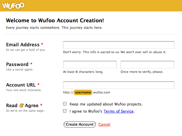 The red asterisks are alarming and confusing to users
Distress Signals
Red asterisks put users on edge before they even begin. Users are wondering what went wrong when they see red asterisks. The red asterisks act as distress signals that make users uncomfortable. Users become more afraid to make errors when they fill out the form, which can decrease form completion rate. Users should be able to fill out a form without stress or confusion.
 By marking the optional fields, this form is easy for users to fill out
To make the user’s life easier, you should quit marking the required fields and only mark the optional fields. This is because users usually come to forms already expecting to fill everything out. It’s the implicit nature of filling out forms, so there’s no need to tell users what they need to fill out.
What’s more helpful is telling them what they don’t need to fill out because it cuts down their work. The only time a user would question whether a field needs filling out is if the information that you’re asking for is something they don’t want to give you. For this reason, it’s important that you only ask for information you need.
Required Fields Outnumber Optional Ones
When you mark optional fields, the result is always less visual noise for the user. This is because most forms usually have more required fields than optional fields. This means less red marks for a clearer user interface.
If you have more optional fields than required fields, you should ask yourself why you’re asking users for so much information you don’t need. Asking users for more information than you need is a sure way to get users to not fill out your forms.
Having less visual noise on your forms makes it easier on the eyes and faster to fill out. You won’t put users on edge with alarming red asterisks, nor will they have to figure out the required fields. By spotting the few marked optional fields, the user implicitly knows that the other fields are required.

Marked required fields with errors should show after submission, not before
There is only one time when you should mark required fields. That’s when the user makes an error on them when submitting the form. Marking erroneous fields with red asterisks tells users which fields they need to correct. The marked fields are more of a signal to users than noise in this situation.
By marking optional fields you tell users which fields they don’t need to fill out which can save them time. But if your form marks required fields with asterisks, users aren’t going to notice which fields they can skip. If you want users to fill out your form faster and easier, avoid marking required fields and mark the optional ones.
UI Design Kit
Affiliate

Why not show ONLY the *required* fields, and show an option to reveal all optional fields? Isn’t that better than highlighting optional fields alone in a many-fields form?
Ah, I like how you’re thinking differently. But I think ultimately most people won’t click on the “show optional fields” option because if its a long form with many fields why would people want more fields to fill out? Personally, if I were to see 5 more fields pop up at the bottom of an already long form I would not like that and would definitely not fill any of them out. At least when the optional fields are shown you are able to tease users into filling it out because they are already in the flow of filling out the form and they can clearly see the field label.
Better yet,
Why don’t try a “hide optional fields” button, which will make the form smaller.
Greets from Germany.
—
Steffen
I agree. If they are not required, why are they there?
Because optional form fields may fetch applicable, sometimes even valuable, data conditionally according to the situation of the person who is submitting that data. Such data should not be disregarded as irrelevant to everyone if it is in fact only irrelevant to some. Therefore, such a field must be optional in order to cater for everyone. I do not want to enter a domain name in this comment form, but some people will.
What site did you grab the second example from? (the one with sub labels within the field)
Good article, thus not sure about highlighting fields that are not required as the user expects the opposite.
I don’t mean highlighting them as to making them bright red or yellow, but instead, just using sub-labels to show that they are not required. This is less intrusive because all forms always have less optional fields than required fields.
Hi Anthony
Thanks for another short, simple and sweet form design article.
While I agree with the conclusion, I can’t say I agree with the initial premise that required field indicators create noise that is distracting for form fillers. To me, this is like saying traffic lights create noise on the roadside that is distracting for motorists.
As I see it, every element on a form should be there to communicate to the user how to successfully fill out the form, and if an element isn’t doing that, it should be removed. As such, required field indicators aren’t fluff, they are part of the conversation between the form owner and the form filler. And I can’t say I’ve seen any evidence, either anecdotal from my years of testing, or experiential, that suggests such indicators prevent people from moving seamlessly through the form.
But as I say, I agree with the conclusion. It makes sense that we highlight whatever is the exception, rather than the rule. Not only does this mean fewer visual elements to process, it probably also means users are more likely to notice the exceptions.
Cheers
Jessica
“highlight whatever is the exception, rather than the rule.” – That’s a beautiful way of putting it!
I agree with Jessica 1000%. I don’t see red asterisks as “alarming” to users — I DO see putting them in an error condition as a no-no. Required indicators are used as a way to clarify what’s needed with the user and common sense should prevail. They are now a standard convention so I don’t see these as requiring a lot of cognitive processing with users as they flow through the form.
Jessica’s right re: it being a contract with the form filler and form owner. If the entire field is required, with 2% optional – the approach in the article that suggests adding the word “optional” in the field makes sense. In cases where that’s the exception, I see no harm in using asterisks (red or otherwise). I’d argue red is part of the problem – non-red might be better to avoid being equated with some error condition (and perhaps lighting up as red on submit).
There’s a little too much Voodoo UX in here for me. I don’t agree with the premise around users being hung up on asterisks and wouldn’t prescribe a fix for what has never appeared a problem in my experience. I also think you’re attaching a lot of conscious thought around users figuring out what’s needed and getting preemptively discouraged. The *number* of fields at a time is far more important and the decision as to put the effort in happens in blink time not consciously.
My two cents… Love the site and love the thought-provoking article regardless with my violent disagreement! 🙂
I agree with Jessica and Theo : the focus shall be on what is important, not what is not important.
That’s how is built the http://www.presta-expert.com/pexpalctnr/pcr web site.
Antoine
Actually, I hate when I finish a form and it reloads with a lot of fields highlighted in red! 🙂
It’s specially annoying in particular when nothing in the first pass indicated that those where required fields.
I think the exact time when a required field should show the red error is when it loses focus and has been left empty. This keeps the noise low and provides the right feedback just when it’s needed.
The only thing I would add to this is that if the design reveals required fields only upon an error, *reveal all of them!*
I can’t tell you how many forms deliver errors one at a time, forgetting that I must sit and wait for the page to reload and scroll back to where I was to correct each time.
For instance, when submitting an iPhone app via Apple’s submission page, you are told only of one field entered incorrectly, even if there are five needing attention. After correcting this one field, you are then told of the second field needing attention (only the second field) and so on.
Hi,
Good articles about forms improvement.
Hey this comment form is missing optional field indicators. 😀
I think I solved but in another way…
I’m actively pointing out which fields are required before the submit button is pressed.
Once the validation succeeds, the field is black again.
requires some coding conventions to work for example, required fields have to have a class called “required”…
I have dubbed it Active Validation 🙂
View a demo here:
http://www.alvinmilton.com/clients/hmm/index.html
I agree that pointing out optional fields instead of required makes sense, only when most of the fields are required. The technique the author used to mark required fields seems to fail in the usability studies I’ve conducted.
Users that use TAB to switch between fields don’t often look at the form field till the cursor is in it. They never see the word “optional” because once the field is highlighted it goes away. I suggest putting the word optional as part of the label, since a user is reading it anyway.
I like the example of using the word “optional” in the answer box but what if the optional question is a drop down or tick box?
From usability perspective, we should be we very cautious on how we design the forms. Companies invest a lot in this area. I know big R&D organizations have dedicated usability teams and this is one of the key items when you do “Branding”. Thanks for these suggestions.
I’m not sure that pre-filling the field with “optional” would be accessible for screenreader users – but I’ll take advice from anyone who knows for sure.
Personally, I include the word (optional) in the field label on the assumption that it will be read out before the user gets to the particular input field.
Certainly a valid argument, but marking required fields has reached the point of being a standard convention. Anyone who’s had to go through just a few online forms should be very familiar with it by now, and more and more people are being exposed to it all the time.
Also, I’m in the habit trying to fill out as few fields as a form will allow – and, thus, in the habit of watching for those markers. I’d argue that often, those who are newer to forms would be trying to enter as little as they can as well, since fear of identity theft is likely one of the reason’s they’ve remained unfamiliar.
Designating fields as required is the norm – especially for accessibility reasons. There is support for this in HTML5 (e.g., the required attribute) as well as ARIA (e.g., aria-required=”true”).
Your comment form has required and optional in the labels.
Doesn’t this add even more visual clutter and creates a weak differentiator – similar length word in brackets.
Nice article.
Without any usability study backing, this article seems somewhat arbitrary. Saying that asterisks scare users and add confusion is a bit much. But maybe there is data that supports this?
Using asterisks as required has been around since the dawn of the WWW. A majority of people know what an asterisk means. Switching the paradigm would confuse people that are used to it.
We should be careful to not propose new paradigms for things that have become commonplace on the web, unless there is strong data behind it not working any longer.
There is the assumption that most designers use red asterisks is not true. Red is a color that grabs attention. And not always necessary. The other assumption is also wrong – people do not go into online forms thinking they need to fill it out entirely. They go into it wanting to know what they have to fill out. This is more easily done if there is some way they can scan to see which fields to focus on.
And I agree with David, no studies back the author’s point of view. And using asterisks is a de facto standard in use for a long time – setting expectations.
So does this mean that all of the coffee cups should replace the “Caution: Hot” labels on hot drinks with “Caution: Not Hot” labels on cold drinks?
I don’t know why you’d want to create a nice looking minimalist and carefully thought out form and then automatically shove dumb looking asterisks next to virtually every field. Just put a symbol like a coloured triangle next to the few fields that are optional, accompanied by a short sentence at the top of form “Optional fields are labelled with “▲”. Form will submit without these completed.” Not exactly difficult to decipher. Come on move on from old ideas.