What does ABC, CNN and Fox News all have in common? They use Arial as their only font for their text. This makes the headings hard to distinguish when users scan. A serif font can give your headings higher contrast and give your website more flavor and appeal.
Look at the fonts used at The Daily Beast in comparison with ABC News:
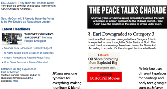
Which site has higher contrast between headings and body text? The answer is The Daily Beast. Their serif headings allow users to quickly scan story headlines because it contrasts so well with the sans serif body text. ABC News’ sans serif headings blend into the sans serif body text making it slower for users to scan each story headline.
Using a serif font for headings and a sans serif font for body text can give your text higher contrast and make it easier to read. Users shouldn’t struggle to scan your headings. Make them easy to scan by giving them higher contrast with a serif font. When your text is fast and easy to scan, you’ll get more activity and engagement from users on your site.
UI Design Kit
Affiliate

Yes I agree. Using different fonts and styles helps. But I’d add that links that are accompanied by a thumbnail image or photo gets the most clicks. Just playing with fonts may not be enough, it needs a picture too.
Not sure about Cambria but Lucida Grande is Mac font.
What do you use for other OS?
What do you think of Yanone Kaffeesatz (http://code.google.com/webfonts/family?family=Yanone+Kaffeesatz) for heading?
The Daily Beast example looks messy and difficult to parse. I’d go for the ABC version. It’s a news site, not an advertising campaign. People are there primarily to scan through information and find the bit that interests them, not battle through a load of text that looks fancy, but is constantly making the eye jump around the page. Good web design is about creating a look and feel that suits the content and context of the page/site.
I think the proposal to diffrentiate between heading and body is fine, the example used is wrong. ABC does differentiate by making the headline big and bold, it may become a bit more nuanced by using diffrent fonts as suggested