A pattern I have noticed on every project I’ve worked on is that the final design that clients choose is always the simplest and most practical one. By realizing that simplicity and practicality are where designs end, designers can save time and energy from creating many designs that clients will ultimately reject. This not only makes things easier for the designer, but it allows clients to get what they want faster.
I’m not the only one who has experienced this. A behind the scenes look at 37signals’ redesign process shows that the final design they went with was the simplest and most practical. But they had to go through many design iterations to realize this.
Version 1
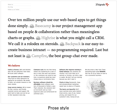
They started with a very simple design. They used an elegant serif typeface to clearly state what 37signals was. Although it was simple, it was not very practical. They thought that “the design was strong, but it relied too much on the person reading to figure out what 37signalsis.” So they kept going and came up with the next version.
Version 2

Their next version was more practical. They broke the page into three content blocks separated by large headlines. Users could easily scroll down the page and scan the headlines to get an understanding of 37signals. They thought that “there’s definitely something here that is working.” However, their next version is where things go awry.
Versions 3, 4, 5
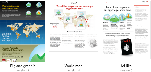
Instead of staying on the path of simplicity and practicality that was working, they decided to go the opposite direction. This resulted in lots of time and energy wasted on extravagant versions that would never see the light of day.
Version 3 was big and graphic, but “not the right direction”. In other words, it wasn’t simple or practical at all. Version 4 was a map that showed their customers all over the world. But ultimately, they felt that “front and center like this makes it a bit unclear”.
In other words, it still wasn’t simple or practical. Version 5 was an ad-like design that mirrored a magazine layout. However, they felt that “the layout, though, is inflexible. It is something that they’d quickly outgrow.” None of these versions contained an ounce of simplicity or practicality.
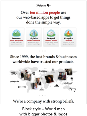
Version 6

After fruitlessly exploring different options, they went back to version 2 that had the most simplicity and practicality so far. However, instead of making it simpler and more practical, they decided to complicate that version by adding the map idea to it. After seeing it, they thought that “the map was unclear. What is it? What are those faces doing on there?”
Version 7
They refined version 6 by making the photos bigger and adding logos to it. But they “didn’t like the map” and felt that they were “not talking about the variety of businesses that use their products.” They were still traveling in the wrong direction with no simplicity or practicality in sight.
Version 8

This is the turning point where they started to get it. Instead of continuing in the direction complex and impractical, they started to simplify the design. They removed the boxes under the company beliefs text in this version, and felt that the design was “good, but still needed to be pushed a little further.”
Version 9
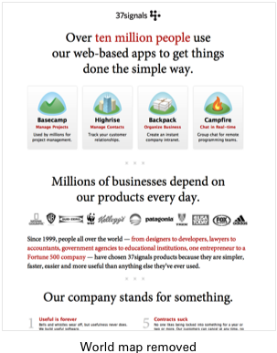
They continued on their new-found path of simplicity and practicality and completely ditched the map idea. They understated the belief numbers and emphasized the headlines. They now “loved the belief section”, but they still “weren’t feeling good about the customer section.”
Version 10, 11
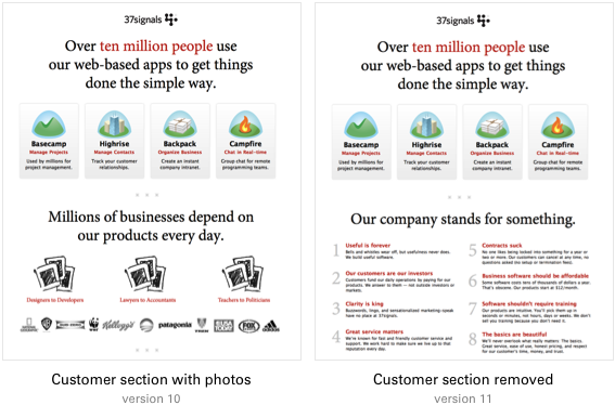
Instead of simplifying the customer section, they thought that complicating it with photos would make it better. Not surprisingly, the customer section was “still not right.” In the version 11, they considered killing customer section altogether. However, they felt that removing it completely was a little overboard and that the customer story was “just too good to not tell.”
Final Design

Complicating it and removing it was apparently not the solution. The solution boiled down to simplicity and practicality. They took the customer section and simplified it by unbolding the text to make it easier to read, and moving the logos to the bottom so it wouldn’t interfere with the headline.
They made it more practical by rewriting the copy to make it clearer and added thumbnail images that linked to a Customers page that expanded on customer experiences.
Conclusion
37signals’ whole redesign process was very long and inefficient. Although they ultimately arrived at the simplest and most practical version of their design, they could have reached it sooner had they realized that the final design is always the simplest and most practical.
It’s always this way with user interfaces because interfaces require human usage and understanding. Simplicity and practicality are qualities that make interfaces easy to use and understand. Designers and clients need to realize and understand this so that they can avoid dumping valuable time and money on designs that will never be used.
Many might argue that doing bad designs are useful because it helps justify the good designs. A bad design can justify a good design, but it certainly isn’t needed to do so. Good design speaks for itself if the designer can speak for it. It’s inefficient and frustrating for clients and designers to go down a path that ignores simplicity and practicality. The client ends up wasting money, and the designer ends up wasting time.
If the designer is uncertain about the simple and practical design they have and feels the need to complicate it just so they’re sure their design is accepted, then that designer does not understand how to justify his design. It is simplicity and practicality that will always win in the end. Move with its current, and you’ll have little trouble reaching a great design. Fight it, and you’ll find yourself in an uphill battle running against time.
UI Design Kit
Affiliate

Fun and practical read…thanks for sharing with us 🙂
Version 3 is total execuporn…I can see plenty of clients going ooooo-aaaaaaah over it…although you (as a designer) might have included in the mix to ‘strengthen’ your design with pure wins.
I’m a little curious why the article starts off with the claim that clients always pick the most simple and most practical design, but then uses an example of an internal team going through a design process.
I do not know which clients you speak of, because most of the clients I’ve had the pleasure to work with come to us BECAUSE they don’t understand the most simple and practical approach. If they understood what that approach was, they would probably be experienced designers.
I understand that ‘always’ is very absolute and you didn’t mean it literally, but I wouldn’t even go so far as to say ‘most’ or ‘many’ clients choose the best route. It’s our responsibility as professionals to help them arrive at the best design.
Now that I’ve said my peace on that, I’ll tackle the final claim – that if we just went right to the best design first we’d save so much time and money! I find this slightly naive – the whole point of a design process is to find the best design, and that is almost never arrived at on the first go around. Why would any design intentionally make bad designs, only to say “well, I think it’s time we made the right one.” It’s not an arbitrary process – iteration is what breeds efficacy. I
Clients come to you because they don’t understand what’s most simple and practical. That’s why you should give them a design that’s simple and practical, not the opposite. Most designers veer towards the opposite and then realize that simple and practical is the way to go when clients begin approving those designs. I believe that’s what happened with 37signals’ redesign process.
Nobody is saying that you can go right to the best design in one fell swoop. Simplifying a design and making it practical takes time. But if you veer from what’s simple and practical, you end up wasting more time.
This video http://vimeo.com/33909857 sums it up in an entertaining way.
Nice curation of the process,
the whole let’s have a CAPS discussion in the comments is a bit of a shame. I get both your points ( so do you both probably…
Except that simplicity isn’t really the goal. Clarity is the goal.
There’s a big difference.
Simplicity is easy. Especially easy to do badly. Version 1 was simple, but neither as clear or as effective as the Final version.
Clarity is hard. Getting to clarity often requires slogging through a lot of complexity.
So the real question is:
Could 37Signals ever have got from Version 1 to their final design without hacking their way through the undergrowth of Versions 2 through 11?