What tool would you use to hit a nail in? Only a hammer comes to mind. This is because a hammer’s form meets that specific function. It’s form matching function gives it its utility and value.

A wireframe is only useful and valuable if its form matches its function as well. But many wireframes today don’t follow this principle. As a result, they can end up hurting how others view the future direction of the design. No designer wants to harm their team or project. But if your wireframes don’t have the right form, you could.
The Wireframe’s Function
In order for your wireframe to have the right form, you have to understand its function. The wireframe is a document that’s completed before graphics and coding ever occur. But they can’t occur until you define and arrange the elements for each page.

A wireframe’s function is to display necessary page elements in an orderly arrangement. The UX designer defines this arrangement through user research, best practices and stakeholder goals. It’s then vetted through stakeholders to gain consensus before moving to graphics and coding.
Why Visual Clarity Is Important
Since you have to share your wireframes to gain consensus, visual clarity is of utmost importance. Stakeholders need to be able to see the structure and strategy for the website without getting distracted by how each element will look in the final design. A wireframe should allow them to examine:
- what elements should be on the page
- why they should be there
- where you should place them
- how they should function
When you put different shades and colors on your wireframes, viewers get hung up about how each element will look. Even if you tell them the style isn’t permanent, they still can’t avoid it because it’s a natural reaction to what they see. You want them to think about style in the graphics stage, not wireframing.

Important questions about site structure and strategy need to get answered first. Wireframe styles make this harder to do. Colors, shapes, fonts and images cloud the vision you’re trying to communicate. This can lead to your team making wrong decisions that could have a lasting impact on the site.
Wireframe Styles That Reduce Visual Clarity
Dysfunctional wireframes exist when designers let their personal style get in the way. Sometimes they add style to sell their wireframes to stakeholders better. Other times it’s done out of vanity.
Whatever the reason, style over substance has no place in wireframes, when substance is what makes a wireframe. Here are some wireframe styles that reduce visual clarity to avoid.
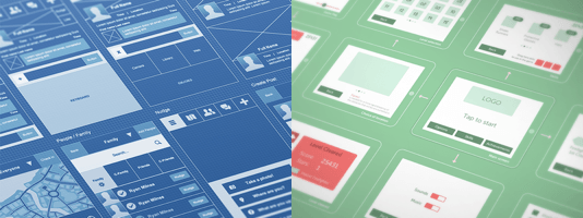
Colored Wireframes
The big difference between a wireframe and a mockup is color. When you put color in your wireframes, you mix its function with that of a graphic mockup. The mockup’s function is to communicate branding and style, not the wireframe’s. Mixing the two reduces the wireframe’s visual clarity, making structure and strategy harder to define.
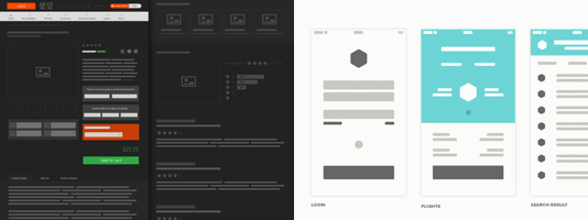
Grayscale Wireframes
Grayscale wireframes used to be the conventional style. But the various shades of gray distract from the wireframe’s function. This leaves viewers wondering why certain elements are lighter and darker gray than others. It draws too much focus on individual elements and not enough on how the user experience works as a whole.

When you’re using gray on gray, you have to use different shades to make elements more distinguishable. This gives you more work to do. If you’re spending time getting the shading right, you’re taking time away from developing the site’s structure.
Grayscale wireframes also make elements hard to see and read. This can cause confusion and eyestrain when viewing. You don’t want your team to experience this every time they view your wireframes after each iteration.
Block Wireframes
A structure is useless if it can’t fit the content. It’s important to know early if your content will fit within the structure you’re designing. Block wireframing makes this hard to see by replacing text with blocks.
Text length and height can affect the size of buttons, menus, headings, paragraphs and other fixed areas. Viewers can’t get an accurate picture of how users will read the site if they can’t see how the text fits in the UI. Nor can they get an accurate measurement of element or margin sizes.
Monochrome is as Clear as it Gets
The best wireframe style is no style. The result of no style is monochrome – one color against white. This is the clearest form of wireframing that matches its function.
When viewers look at a monochrome wireframe, all they see is structure. There aren’t any colors or shades on particular elements that fight for their attention. Instead, everything is equal weight so you can focus on the whole user experience. This forces viewers to debate the arrangement of elements, rather than how they will look.

Another benefit to monochrome is that you don’t have to worry about making shades of gray or color tones look good together. You’re only working with one color, so when you wireframe you’re concentrating on the structure, not how it looks. This keeps you focused, saves you time and helps you make iterations faster.

The monochrome color you use should have a high enough contrast against white that it’s easy on the eyes. Gray on white tends to make elements look faint and dull. Black on white tends to have a heavy contrast that can strain the eyes. The perfect balance for a clear and pleasing look is dark blue-gray on white. It’s not only easy on the eyes from afar, but also up close when examining detail.
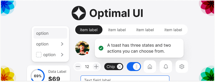
Monochrome Wireframing Toolkit
Wireframing in no style isn’t easy if you haven’t done it before. You can get Wireframe Patterns, a monochrome toolkit we designed that offers many desktop and mobile libraries each with an array of complete UI patterns.
 Final Thoughts

A dysfunctional wireframe can break a team apart if people can’t see eye-to-eye on a site’s vision. A functional wireframe can bring people together if everyone is clear on a common vision. You need visual clarity on your wireframes for this to happen.
Don’t allow your personal style, preference or vanity get in the way of a document that everyone shares. The goal of a wireframe is to get consensus on the user experience. Make it easier on yourself and your team by adopting a wireframe form that matches its function.
UI Design Kit
Affiliate

I don’t agree 🙂
if you use grayscale consistently i think it can communicate way more then just monochrome.
I think a wireframe should in some way indicate, or better, communicate to your team and client, that some elements should attract more of the viewers attention.
For example: I think the most important CTA button should be more prominently visible, even in a wireframe…
Monochrome does allow you to make buttons and images stand out through inverse highlighting (white text on dark fill). If you’re relying solely on color weighting for hierarchy you’re designing wrong. You should use other ways to call out what’s important, such as shape, sizing, order and placement. Don’t use color as a crutch for bad design. Monochrome forces you to focus on good design because you don’t have that coloring crutch available.
This makes a clear argument and points up some ‘Don’ts’ that I agree with – but I disagree with the main point.
There are definitely distracting flourishes to avoid in wireframes – but their is not a magic ‘no-style style’ that is best at communicating. Communication of structure is no different to any other kind of communication – you can use emphasis, metaphor, shorthand and many stylistic tools to make your point.
The way I would put it , is if you had to describe the structure of an app verbally – would it be best delivered in monotone? No, you might need to raise your voice, talk conspiratorially, joke, shrug, emphasise and smile – because these HELP you explain it. This can be done badly – and it leaves people wishing you HAD just delivered it in monotone – but when done right, it is more effective than not.
This means, I sometimes use a looser style for very early wireframes- to put the recipients in an open-to-change state of mind. Some notes are put as if handwritten on the side, to impart secondary, but sometimes critical contextual information. If there is a sore point in functionality, I might treat that more sensitively or humorously depending on the recipients.
All style is, is communication – so I would never favour arguing for a time to use ‘no-style’ – just a very judicious use of it, as always.
I’ve found monochrome wireframes make hierarchy almost impossible. Almost everything, with the exception of typography which has varying weights and sizes, is on the same level in the hierarchy which can complicate the flow.
With grayscale, I can at least show a tiny bit of hierarchy and visual flow. For me, it makes finishing it in photoshop a breeze because I’ve already identified the different levels of elements, which translates to different colors and shades.
Good writeup of the different options. Never considered using a color-based wireframe.
That’s because you’re doing it wrong. You can use inverse highlighting to make elements stand out. You shouldn’t rely only on color to show hierarchy anyway. You should also use vertical/horizontal page order and element size/shape as well.
Thank you for the great article. I totally agree with you.
I wish all designers read this and stop using Konigi Stencils in Omnigraffle for their wireframes.
I think what is being said in this article has a place when what is being communicated is done so with the ‘right’ creative stakeholders. An unbiased approach to wireframes allow for stakeholders to easily reassemble and swap elements quickly and clearly like building blocks.
But often there is an element of burden that should be taken off of stakeholders, where showcasing a well thought out wireframe is crucial for fast development. And any emphasis on hierarchy being communicated early on, acts as a positive bias for directing the UX process.
Detailed UI’s are so appealing to some clients that it can be hard to explain to them that less is more in the early stages. Monochrome wireframes work best, I think, as they can communicate structure and flow much better than detailed mockups and allow for much faster changes.
Also, if you’re sticking to two colours (white + something), it’s very easy to ‘theme’ your wireframes! This simple detail can make clients very happy, as in the early stages they just want to see a fleshed out product, and this brings them closer to that while allowing us to find the best solutions in an app.
I’m damned if I’ve ever used any more than 3 different shades of grey (or 2 and blue) in a wireframe – black text, black headers, grey boxes for images (I think #ccc with a slightly darker border) and a dark colour for primary buttons (the secondary button will be white or one of the other greys).
The grey for images serves an important purpose – to show at a distance *what will be shown as imagery* – what can look like a expanse could actually get very busy once you get pictures in.
The other thing that using grey for images helps – you can actually annotate on the image what the image is supposed to be (e.g. product image) and/or if text is supposed to go over it as.
The Better Defaults Axure set I feel got this right (you don’t think about different greys, you just use it!).
So, YMMV.
How do you differentiate between a hover state or a parent vs. an active state of a menu hierarchy with monochrome?
Those are all important state/information differentiations when laying out a wireframe
As mentioned before, you would inverse highlight (white text on dark fill) elements you want to call attention to. You can also use a mouse cursor or annotations to point out different hover states. There are many ways to differentiate hover states on a wireframe.
What about when your dropdown inverse hover is overlaying an already inverse or monotoned area? Ah ha!
You’re doing it wrong, James, as Anthony already mentioned before.
While I agree that wireframes should not introduce branding elements, this does not prohibit the use of color.
Screen wireframes are first and foremost meant to document information architecture and heuristics. As such, they need to convey 3 different things to the end user:
1) state (Where am I and what have I done?)
2) signposts (Where should I go from here?)
3) emphasis/hierarchy (What is important?)
The flaw with “monochrome” wireframes is that they fail to document the difference between these three in a way that is immediately obvious to an untrained eye. Remember: visual designers are not always skilled information architects, so they might need guidance as well.
That’s why I tend to use a combination of grayscale and typography for hierarchy, and one or more contrast colors to document state and signposts — usually blue for the latter since this is the most well-known metaphor for hyperlinks.
A monochrome wireframe is no more no style than one with greyscales or colour – they’re all design decisions.
Granted, many people misuse colour in wireframes, but wireframes are used for many purposes, not just to “display necessary page elements in an orderly arrangement”.
After all, wireframes are communication tools, and if colour, greyscales or whatever else helps you communicate, why would that be wrong? For instance, the squiggly lines in Balsamiq is a signal that it’s not a finished design.
For what it’s worth, I’ve seen people argue that wireframes shouldn’t concern themselves with layout, and had example wireframes that basically just listed the content. I’d argue that’s closer to “no style” than your fairly high fidelity wireframes.
Thank you for the article. I would like to get your comments on the use of fonts. In my opinion, using Arial or anything other than a Sketch-style font communicates design where it should not be. Using a sketch-style font clearly let’s the client know, “This is about placement, workflow, structure, etc. and it will be refined.” Could you speak to that? Thanks.
In my experience using sans-serif fonts like Arial has never confused my clients. Clients prefer to be able to read the labels on their interface. Sketch style fonts appear faint, wispy and are harder to read. Not only that but sketch “style” fonts communicate a style. The point of wireframes is to move away from style. The closest fonts to that are sans-serif ones.
Try to choose a sans-serif that doesn’t have too much or too little tracking (letter spacing). You want to design your button and navigation widths to the size of your labels. Sans-serif fonts like Helvetica or Roboto that have a more moderate tracking are ideal.
How do you deal with the various states? Im wrestling with how you would display disabled with a single color.
Thanks for the article.
It’s unfortunate when the wireframe’s visual appearance starts to dictate graphical affordances that the UX and visual designer can’t get behind. I’m bookmarking this!