The use of color is one of the best ways to communicate visual hierarchy on a design. But on a wireframe, it’s one of the worst. Many designers think they need to use color on a wireframe to communicate hierarchy. If you’re using color to display visual weight, your final design could lose its clarity.
Color Obscures Hierarchical Clarity
It’s easy to see the weight of a colored element on a wireframe because everything else is black and white. But there’s no way to know if that element will have the same clarity when you translate that wireframe to a mockup.
This is because a mockup will have many other colors that compete with it. Any colored element on your wireframe will no longer appear as clear. The visual weight you gave it lessens when other page elements also have color.

Another danger of using color is that many designers end up relying on it as the primary way to show visual hierarchy. It’s easy to make elements stand out with color on a wireframe. But how clear is your visual hierarchy without it?
Color becomes a crutch for clarity when designers neglect other hierarchical attributes. Don’t use color to compensate for a lack of design. Your design should have a clear hierarchy without it.
Using color isn’t always effective because many sites have color blind users. Your design needs to include other attributes to make the weight of elements clear to all users.
Other Attributes of Visual Hierarchy
Adding color to your wireframe makes it hard to gauge how strong your visual hierarchy is. This is because color overshadows other hierarchical attributes. When you avoid color, you allow those attributes to stand out. The visual weight of color gets lost on a mockup, but these attributes stay intact.
Size
Not every element should have the same size. The bigger an element is the more attention it’ll draw. For size to work, an element needs to look bigger relative to the other elements around it.

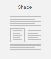
Shape
You may have content on a page you want to highlight. You’re not limited to only color and size. You can also use shape. Placing a box around the content or sectioning it off with a line shows that area is important.
Placement
Users scan pages in a particular pattern. There are page areas that will get more attention than others. You can place important content in those high attention areas. Above the fold and along the top and left-hand sides are where the user’s eyes fixate on the most.

Inverse Coloring
Color obscures hierarchical clarity, but inverse coloring can add to it. Most wireframes use dark colors on a light background. This is because most sites often use a neutral background color.
But when you inverse the colors, you’re applying a light color on a dark background. This is an effective way to communicate color without suggesting a specific color.

Suggesting a specific color will make viewers wonder how that color will affect the rest of the design. That’s not what you want on a wireframe. You want them to focus on the structure and layout.
You should use inverse coloring on interface elements that need a strong color fill. Buttons, menus, and notifications often need this visual clarity because users interact with them. But don’t over do it. You’ll lose hierarchy if every element is light on dark.
Wireframe Patterns
There are wireframing toolkits that can help you communicate visual hierarchy easier. You can get a wireframing toolkit we designed called: Wireframe Patterns. Each UI pattern is designed with visual weight and clarity without using any color.
A Visual Hierarchy Without Color
If your visual hierarchy isn’t clear without color, your design doesn’t use enough attributes. It’s not only possible to communicate visual hierarchy without color, it’s necessary.
Doing so allows you to gauge the clarity of your structure and layout. A wireframe that isn’t clear without color is a wireframe that lacks a strong hierarchy. Adding color won’t fix it, a better design will.
UI Design Kit
Affiliate
