Floppy disks are a thing of the past. People used them to store digital data, but not anymore. You won’t find them in computers today, but you can see remnants of their existence on the “Save” icon.
Using the floppy disk icon to save data made sense back then, but it doesn’t feel right to keep using it because future generations of users won’t recognize what it means.
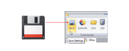
The floppy disk is old, obsolete technology with an expired lifespan like videotapes and cassette tapes. If users weren’t exposed to floppy disks growing up, it’d look foreign to them as an icon.
Assigning the floppy disk icon for “Save” was not a good choice from the beginning. Saving data is such a common action that it needs a timeless icon everyone can recognize. This way, the icon will become a part of a universal interface language that all users are familiar with, no matter what year it is.
For example, the “X” icon for closing elements is timeless and universal. Users across different cultures and timelines understand its meaning. This level of recognition is how all icons for standard interface actions should be.
Subscribe to read the full article
Become a paying subscriber of UX Movement Newsletter to get exclusive access to this article and other subscriber-only content.
UI Design Kit
Affiliate

Such an observation Anthony!
But why stop there? Who uses paper folders still? Paper envelopes for an e-mail? Why is a calculator on MacOS shaped as an old calculator device? When did you see one IRL last time? Twitter is not a bird! Padlock as a password icon is so past, key cards are the future!
Way to go Anthony. Also, if you’re suggesting “a timeless icon everyone can recognize” would be great to actually suggest an icon. You know — walk the walk buddy.
Absolutely correct. Walk the walk. And what about the trash bin icon? I think there are icons used as metaphors that will never die. If the floppy disk is one of them, the future will show.
I strongly disagree. Everyone knows that this shape is for saving. I’m pretty sure that younger generations don’t even know what it represented at the beginning, and there is nothing wrong with that. We seldom have in our culture icons with so unified and memorable meaning as disc icon, so it’s irresponsible to get rid of it for some undefined replacement. Do our cameras look like the ones on the “camera” icon? No. Do our microphones look like on the icon? Also, no. Do our video recording cams look like on the icon? No, not really. Do you send letters in envelopes using mail app? Well, you are not. Still, mail icons often have form of a letter.
Interesting point but I disagree with this article. I agree with Kamil. New generations know this is the save icon. The principle of “Don’t make me think” means the save icon is perfect… everyone knows what it means! I remember seeing a golden video on YouTube where they were showing kids an old floppy disk. One kid said “Oh cool! You 3D printed the save icon!” Was heart warming, eye opening and enlightening all at once 🙂
I disagree. BUT, I think the use of a save button will decrease along the time because applications save things automatically.
Why is the call icon a telephone handset? Why is record an old timey 1930s microphone? I mean, folders? Talk about boomer stuff, and what does a circle with notches even have to do with time? Hell, why are we still using Latin alphabet characters? I’m not sure anyone has noticed but the Romans haven’t been a thing for like 2000 years. I fully agree with you and support you 100%, we should completely dismantle design language as we know it, it’s all way outdated by now.